
By Catherine Austin Fitts
My “go to” website for technical analysis of precious metals, the US dollar & the US stock market is Rambus Chartology, where Rambus (that’s his handle – he’s the founding technical analyst) leads a discussion with extensive charts of what the markets are saying.
In January 2016, Rambus launched his quarterly Solari Report with a Blockbuster Chartology. You can find links to the entire series of quarterly and annual Blockbuster Chartologies at the end this latest piece.
One of the reasons that Rambus is so good at his craft is that he focuses on “staying on the right side of the major trend.” The challenge of doing so at this time is that it is tempting to look for bottoms or to assume that the trend upwards in the US dollar or stock market may be over. However, Rambus consistently brings us back to the discipline of the Chartology. What does price tell us? As he describes so aptly, we are dealing with psychological warfare.
Sitting back once each quarter to get this perspective offers invaluable insight. So, here we go for the 3rd Quarter 2018 Blockbuster Chartology!
Blockbuster Chartology Quarterly Report
By Rambus
~ 3rd Quarter 2018 Wrap Up ~
- Quarterly Report “The Big Picture” Part 1
- Quarterly Report “The Big Picture” Part 2
- Wednesday Report… Comprehensive Currency Update
- Weekend Report… Gold and PM Stocks
- Stock Market Combo Chart Update…
- Weekend Report: 2019-The Year of the Bear Market by The Plunger
Quarterly Report “The Big Picture” Part 1 – October 21st, 2018
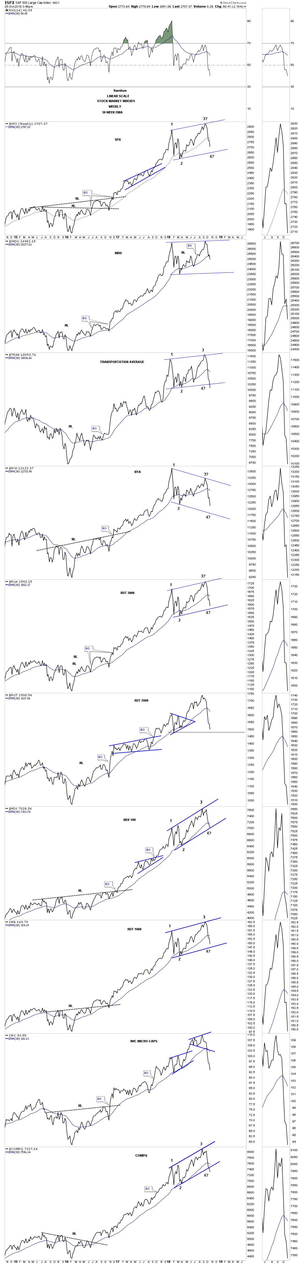
From February 2016 to the recent high most US stock markets enjoyed a good two year run after breaking out from their 2015 consolidation pattern. That is the type of price action one likes to see during a strong bull market, one consolidation pattern forming on top of the previous one with an impulse leg in-between. At some point the last trading range, that may look like another consolidation phase, will turnout to be just the opposite and will be a reversal pattern. It’s hard to know in advance what the ultimate trading range will be, consolidation or reversal pattern, until we get more evidence from the price action itself.
Lets start with a 15 year monthly chart for the $SPX that built out a large complex H&S bottom in 2009 which launched our current bull market. The breakout above neckline #2 was in February of 2012 and that impulse leg lasted until May of 2015 when it was time to consolidate that three year impulse move. The consolidation pattern ended up being the blue bullish expanding falling wedge halfway pattern. If one measured from the breakout at neckline #2 up to the first reversal point in the blue expanding falling wedge, blue arrow, and take that measurement and add it to the breakout point of the blue expanding falling wedge you get a price objective up to the 2875 area on a linear scale chart.
Our most recent trading range began in January of this year at reversal point #1. After reversal point #2 showed itself I drew in the upper and lower trendlines to show how a new trading range may develop, black arrows. In August the SPX closed the month above the top rail of the new trading range which could have had bullish consequences, but the month of September the SPX failed to impulse higher which brings us to October where the action has been heating up.
When the SPX trades below its 12 month sma during a bull market it usually signals that you are in a consolidation zone where it’s not uncommon to see the price action trading above and below the 12 month sma. As you can see the SPX is now testing the 12 month sma since this new trading range began to develop. Even a break below the 12 month sma won’t be the end of the world for the SPX, but if we see the price action break below the bottom of the trading range that would be a bearish development.
I’ve explained many times that a stock does only three things. It builds a consolidation pattern, reversal pattern or is in an impulse move. The current trading range for the SPX is now nine months in the making which is still fairly young when compared to the previous bullish expanding falling wedge. The bottom line on this monthly SPX chart suggests that the trading range will end up being just another consolidation pattern in the bull market that began in 2009, or will be a reversal pattern which at this point could be a slightly unbalanced double top formation if the low at 2532 is taken out to the downside. At a minimum I expect a move toward the lower end of the trading range.

I won’t go into a lot of details on these following charts for the US stock markets as we just covered most of them on the SPX chart above. This long term monthly chart for the INDU looks a lot like the SPX monthly chart above with a false breakout above the top rail and is testing its 12 month sma.

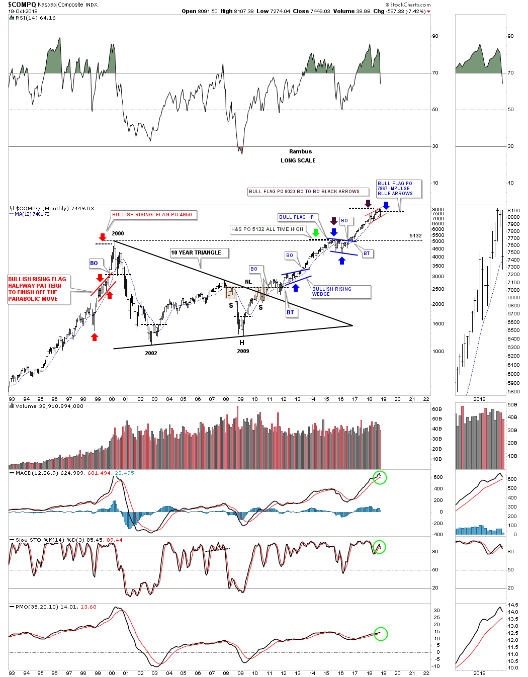
The $COMPQ is setup a little bit differently than the SPX and the INDU as it has been building out a small red rising wedge formation. It too is testing its 12 month sma which so far has been holding support. A strong breakout below the bottom rail of the red rising wedge and the 12 month sma would have bearish implacations. Note the price objectives of the two different measured move techniques I use. The blue arrows measure the impulse method and the black arrows measure the BO to BO method. It is too early to know yet, but if things get out of control to the downside the first real area to look for important support would be down to the 2000 high at 5132. The blue 2015 bull flag that formed just below the 5132 high from 2000 was needed to give the $COMPQ the energy it needed to finally breakout to new all time highs.
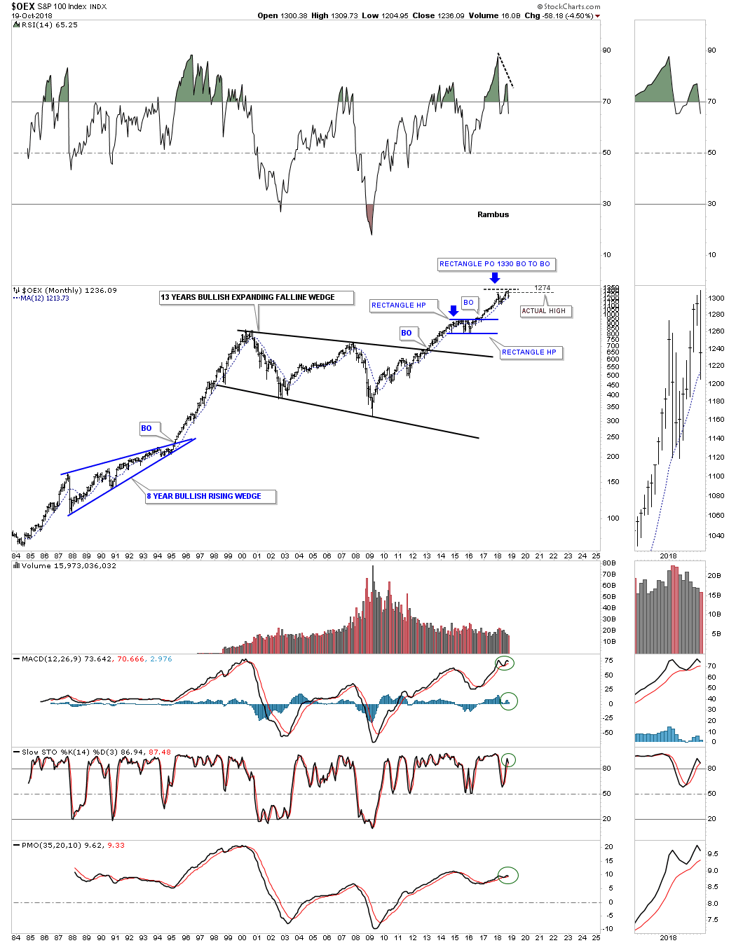
Next is the $OEX 100 which broke out above the top rail of its 13 year bullish expanding falling wedge and formed the blue rectangle which led to the most recent high as measured by the breakout to breakout method. There is a big negative divergence on the RSI.
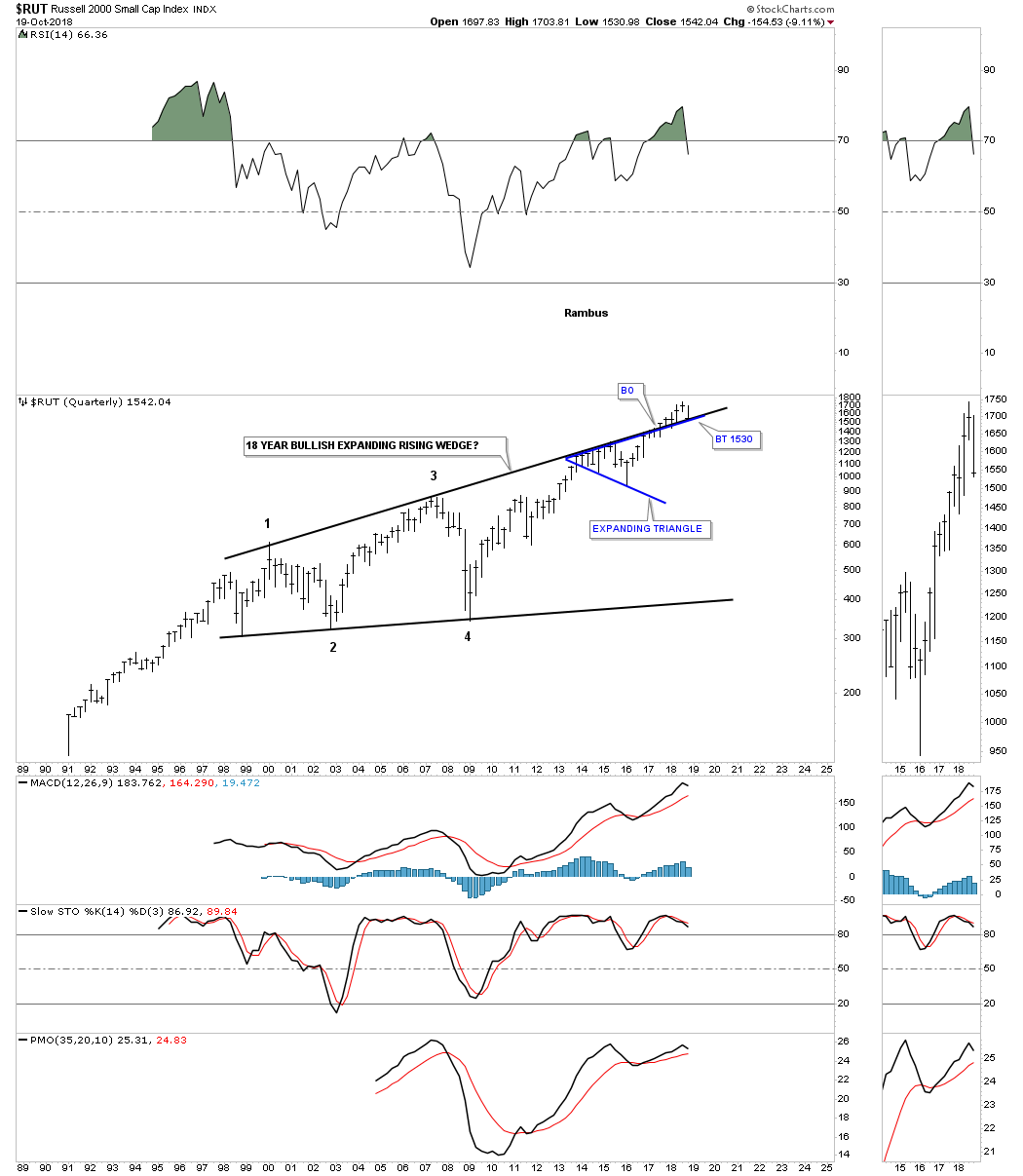
This 25 year monthly chart for the $RUT, small caps index, is sitting on a very important long term trendline as of Friday’s close. Up until a few months ago the small caps were leading the markets higher, but that all came to a screeching halt in a big way this month of October. There is still a week and a half of trading to go this month so there is still a chance that the price action can rally back above the 12 month sma.
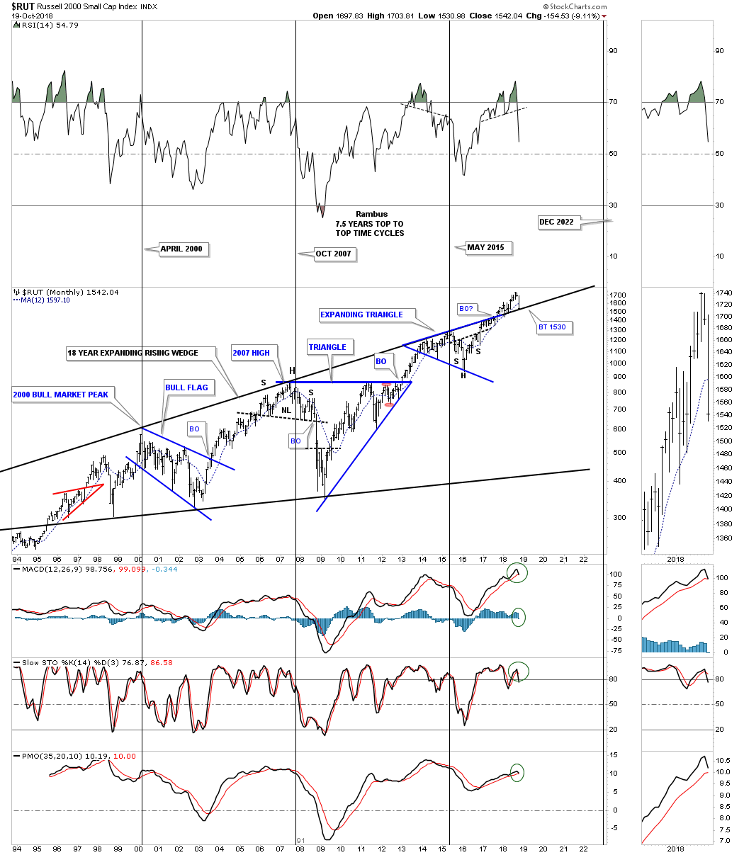
The quarterly chart for the $RUT shows either a false breakout above the top rail or is the backtest going to hold support?
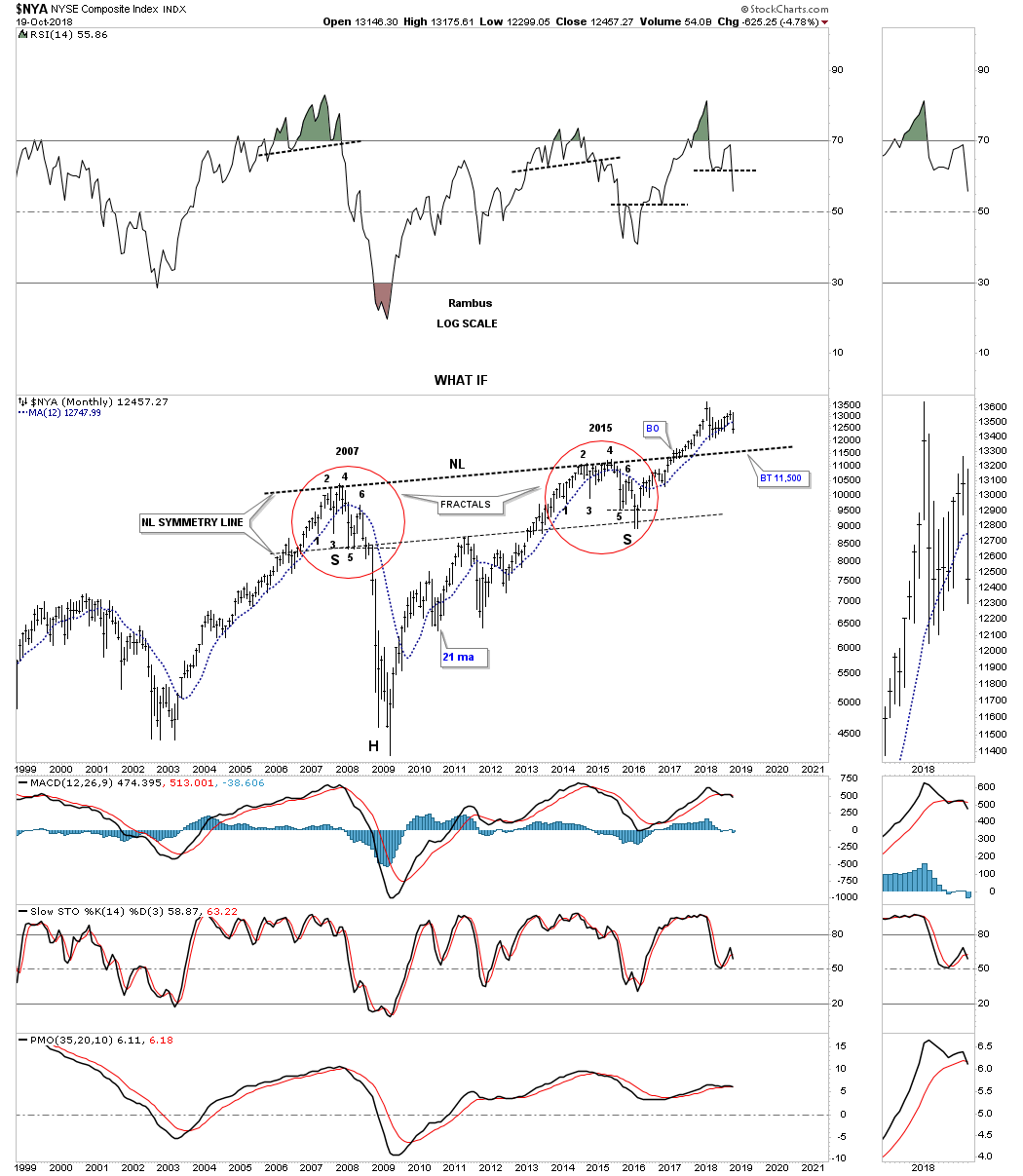
The $NYA is a broad measure for stocks in the US which is currently trading below its 12 month sma. As you can see there is a much bigger potential H&S bottom with a backtest to the neckline around the 11,500 area which needs to hold support for the H&S bottom to be valid.
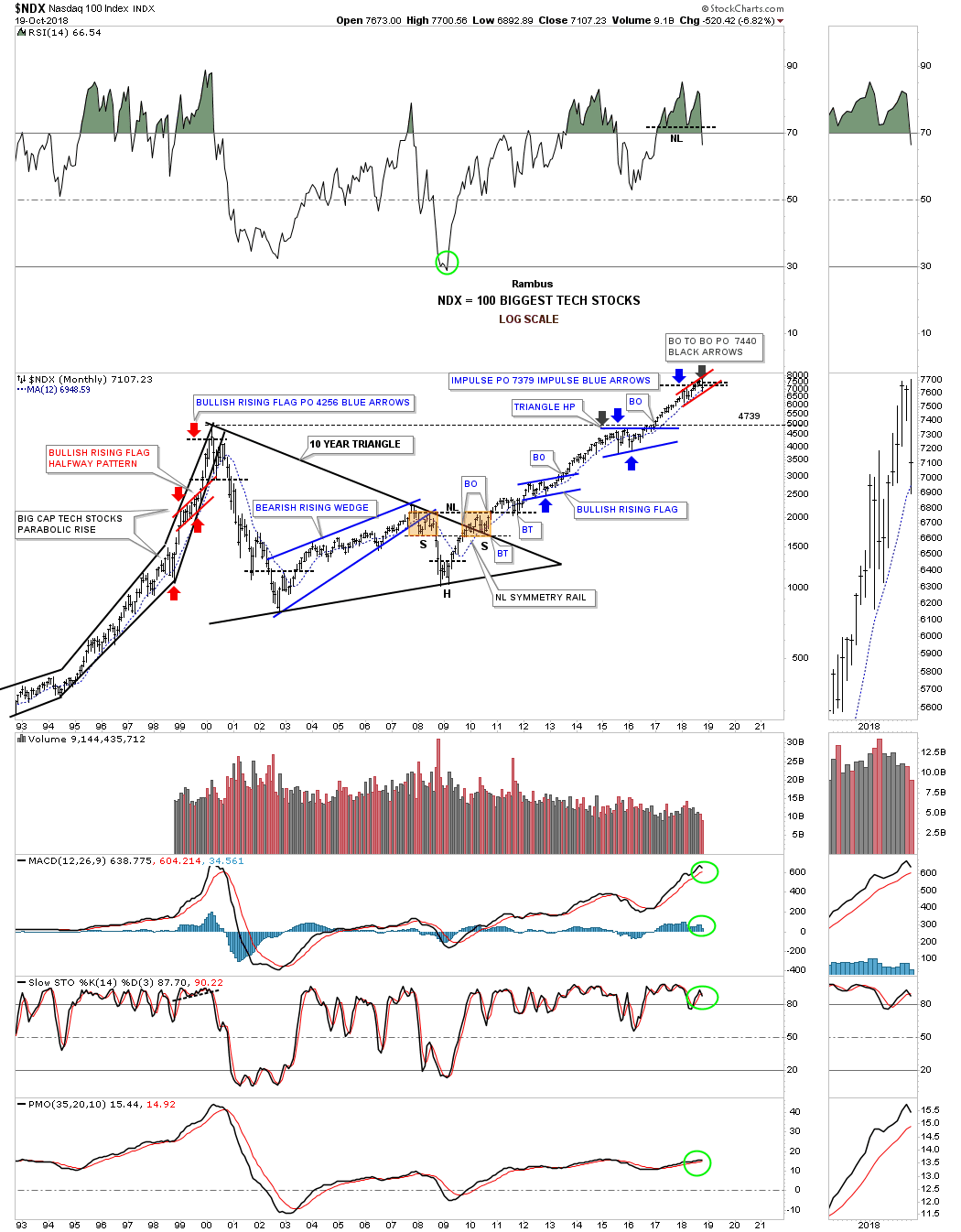
This last long term monthly chart for the US stock markets is a 25 year look at the $NDX 100 big cap tech stocks index, which has produced some nice Chartology through the years.
Starting with the breakout to breakout method we can measure from the breakout point on the blue bullish rising flag in 2013 to the first reversal point in the triangle halfway pattern that formed just below the all time highs at that time. When we add that measurement to the breakout point from the blue triangle halfway pattern we get a price objective up to 7470, black arrow.
The impulse method starts its measurement from the last reversal point in the blue bullish rising flag to the first reversal point in the blue triangle halfway pattern. You then take that measurement and add it to the last reversal point in the blue triangle which gave us a price objective up to 7379 as shown by the blue arrows.
Note the impulse measured move that started in 1998 to the secular bull market top in 2000 as shown by the red arrows. When that price objective was met in 2000 at 4256 there was no way to know at that time if the $NDX would begin the next consolidation phase or begin building out a reversal pattern. As it turned out the 2000 high was the major top that wasn’t broken until January of 2017. It took that 10 year triangle consolidation pattern to correct that pervious secular bull market. That very symmetrical H&S bottom at the fourth reversal point in the 10 year triangle strongly suggested the bear market was over and a bull market of some duration was upon us.
If the $NDX breaks below the 12 month sma and the bottom rail of the red rising flag formation the first area of support would be all the way down to the 2000 high at 4739.
World Stock Markets:
In this part of the Quarterly Report I would like to show you some of the long term monthly charts for many of the world stock markets we’ve been following for a long time now.
First up is the $AORD, Australian Stock market, which broke out of its 10 year triangle consolidation pattern back in 2016, backtested the top rail and began to move higher, but ran out of gas and is now trading below its 12 month sma. The apex at 5550 will be the next area of support which will need to hold. If the price action breaks below the apex then there is a good chance we’ll see an end around the apex move which can be a bearish development.

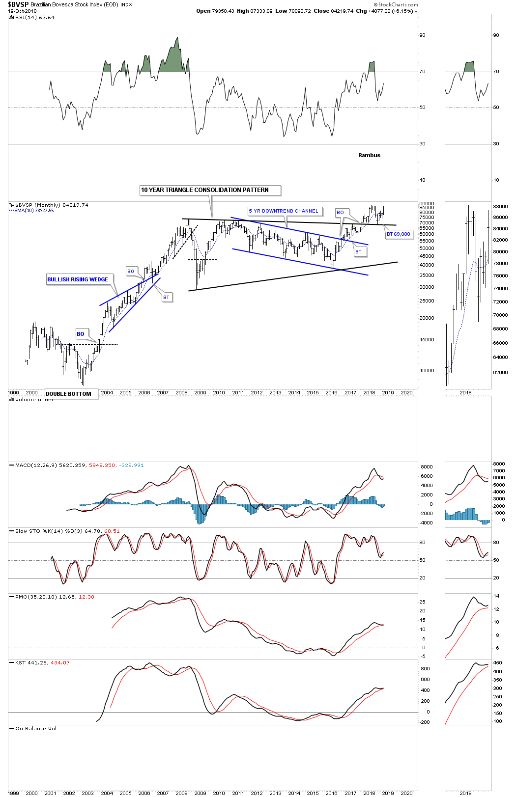
The BVSP, Brazilian stock market, is the big surprise as it backtested the to rail of its 10 year triangle consolidation pattern and is close to making a new all time high. So far classic Chartology.
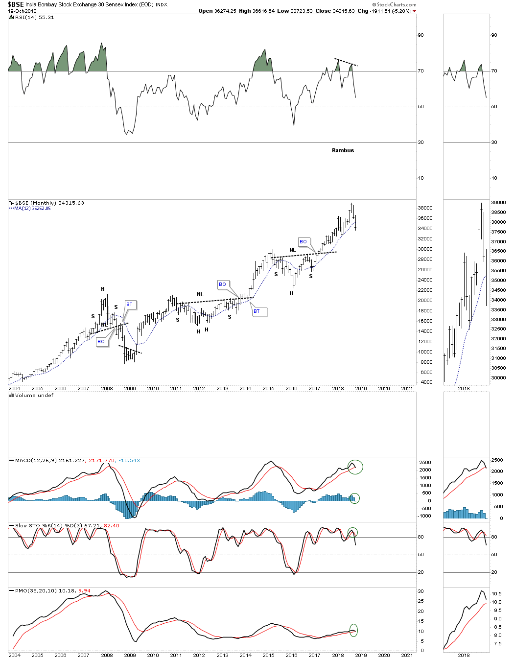
The $BSE, Bombay stock market, was doing very well until two months ago when the price action began to turn down and is now trading below its 12 month sma with a negative divergence on the RSI.
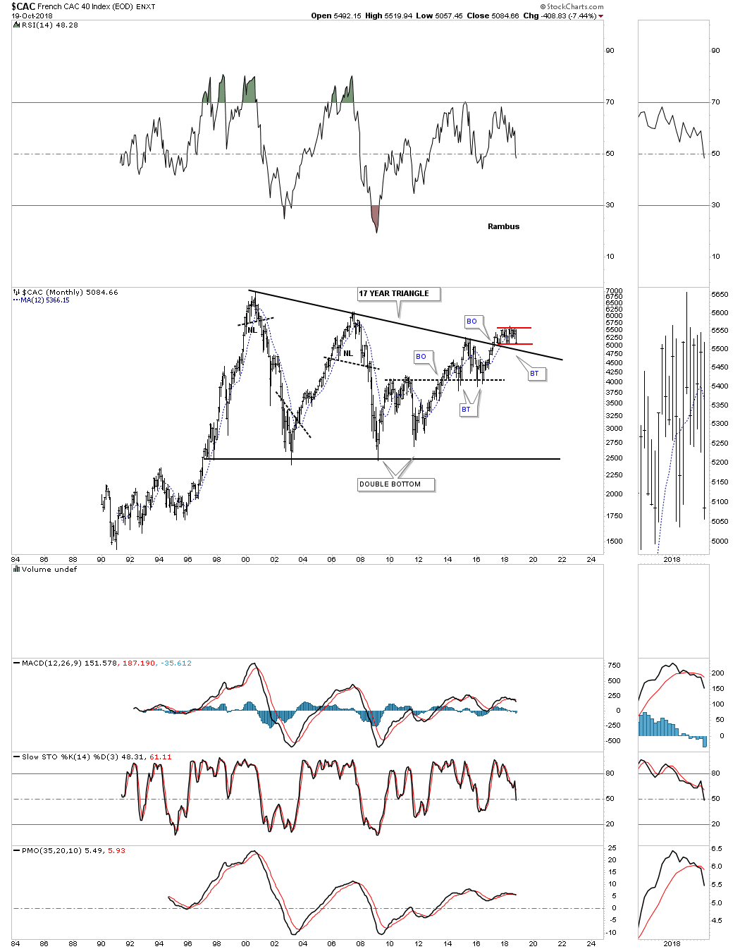
Next is the CAC, French index, which broke out above its 17 year triangle consolidation pattern and is currently attempting to backtest the top rail building out the small red consolidation pattern. A break back below the top rail of the big triangle would negate the breakout.
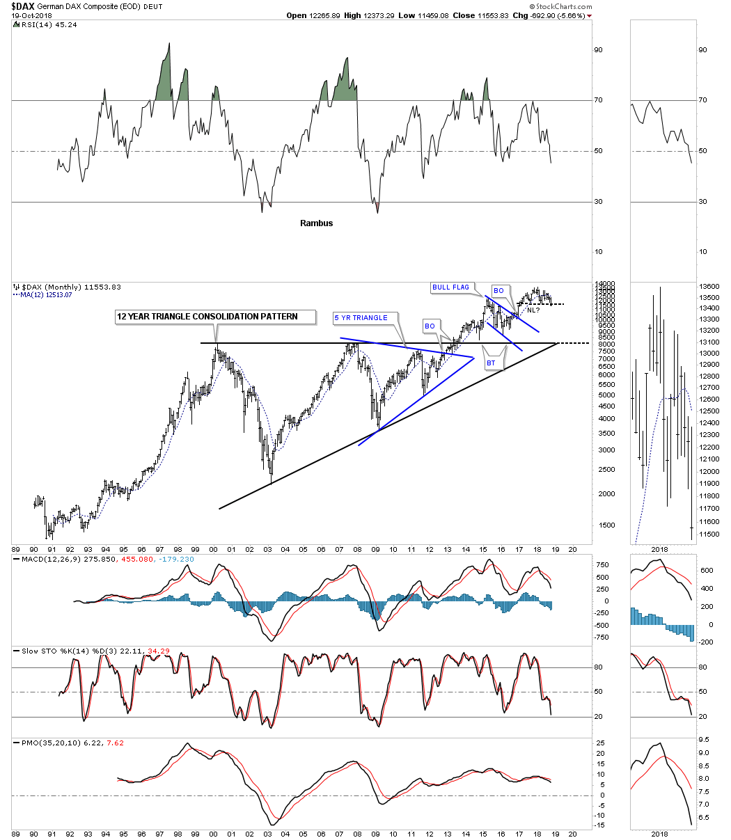
The $DAX, German stock market, is an important stock market to keep a close eye on because it’s possibly building out a H&S top and has been trading below its 12 month sma for seven of the last eight months. As it goes, so will most of the European stock markets.
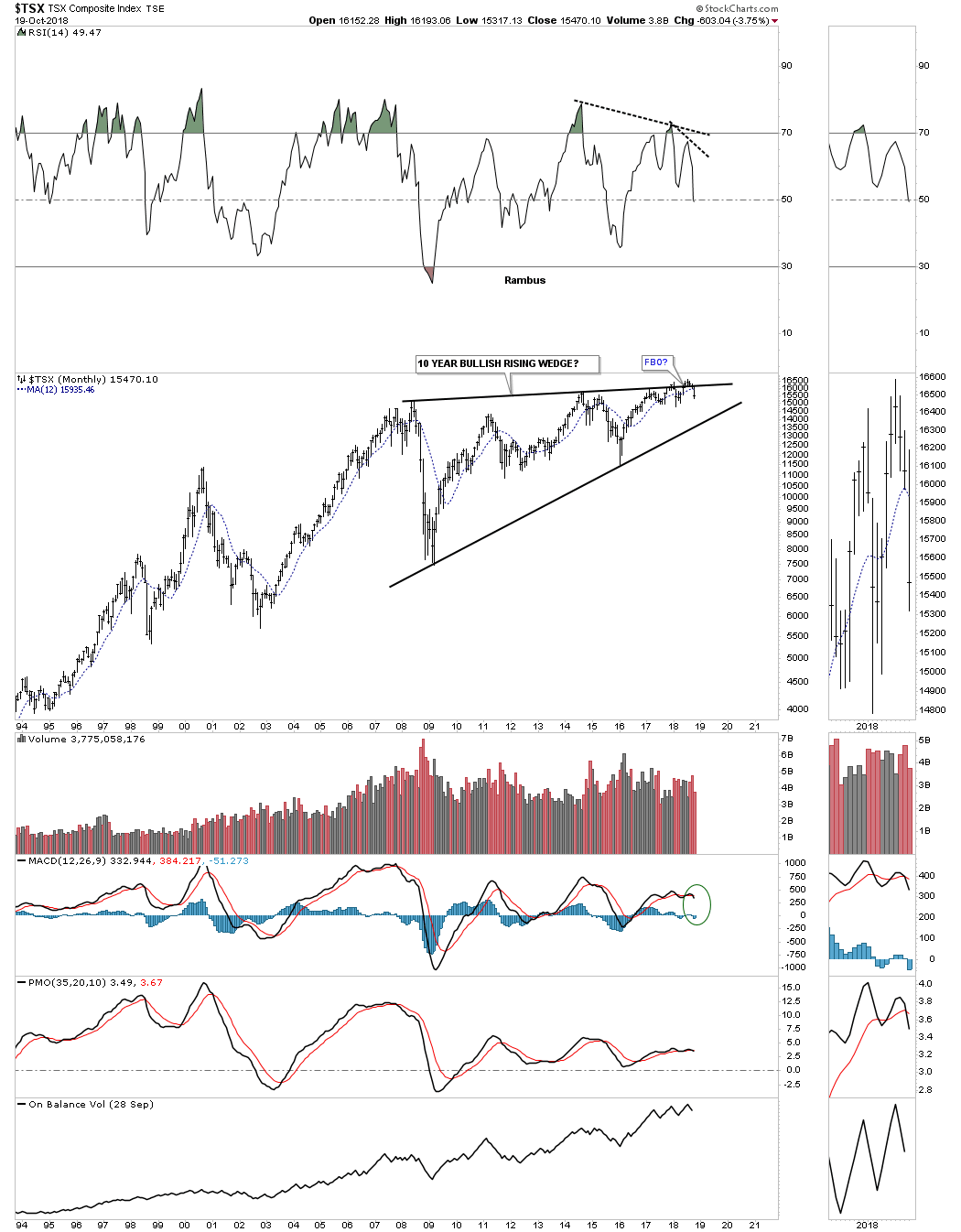
The $TSX, Toronto stock exchange, is failing to breakout of its 10 year rising wedge formation.
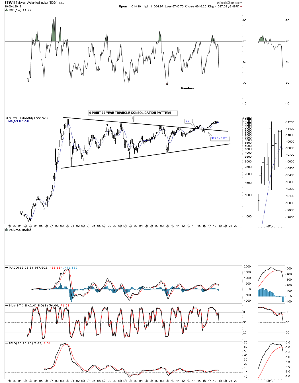
$TWII is still holding its breakout but is moving lower toward the top rail of its triangle consolidation pattern and is also trading below its 12 month sma.
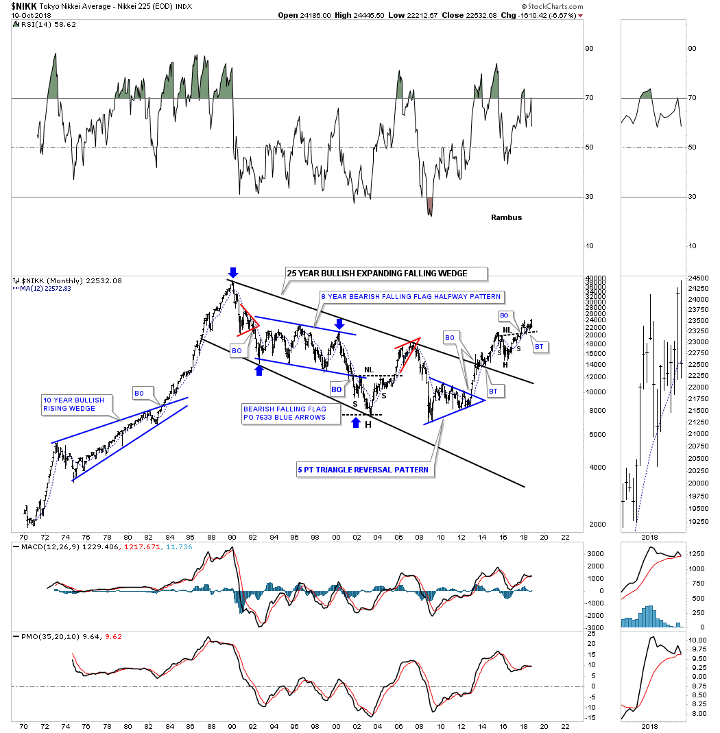
The $NIKK, Tokyo stock market, is still trading above its H&S neckline and is currently testing its 12 month sma.
Last quarter I posted this chart for the $SSEC, China stock market, and said this was our problem child compared to the other world stock markets we looked at, as it was starting to crack the bottom rail of its massive uptrend channel. As you can see we got the backtest to the bottom rail which may signal the impulse move down may be underway.

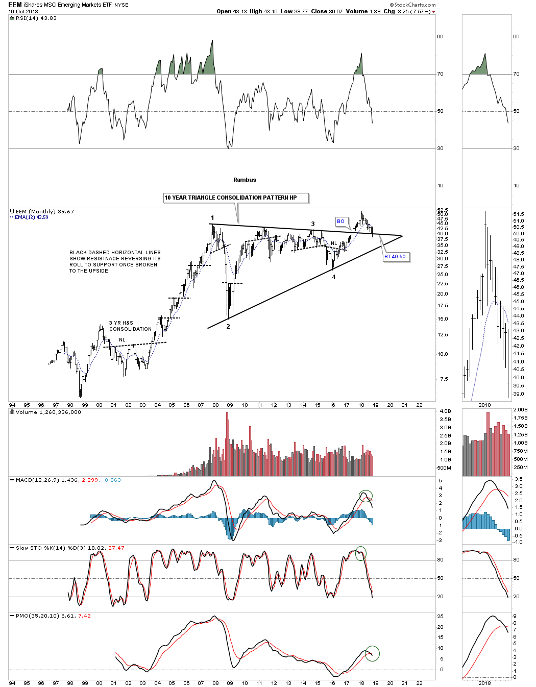
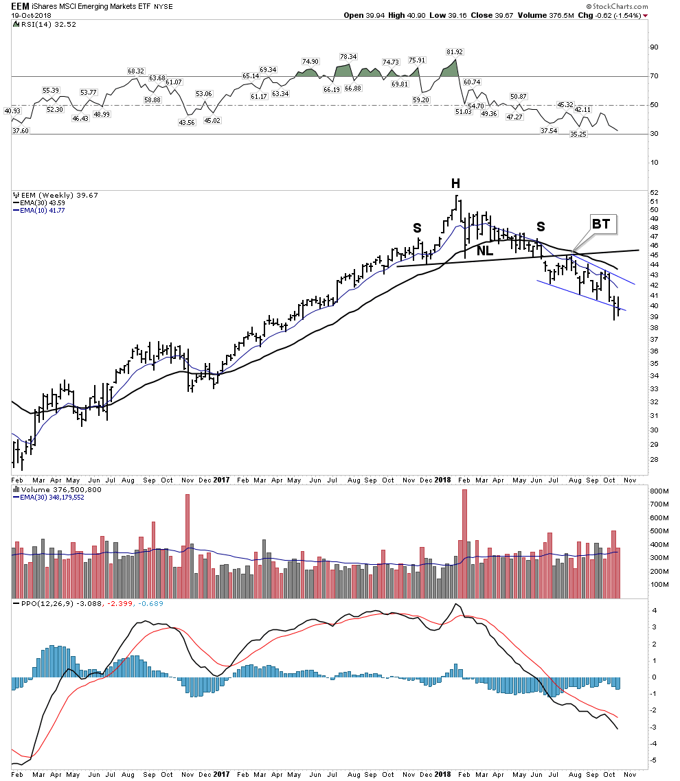
Last quarter when we looked at the EEM, emerging markets etf, as it was still trading above the top rail of its 10 year triangle, but has reversed hard to the downside and is starting to break below the top rail and the 12 month sma.
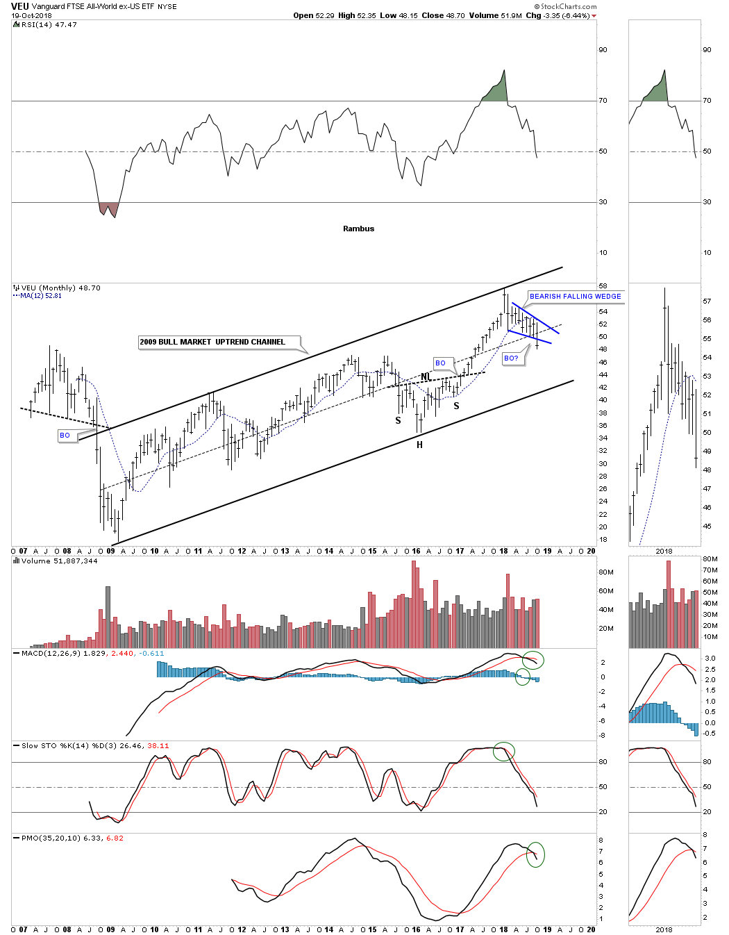
VEU is an all world stock market etf ex the US stock market, and is trading in the middle of its 2009 bull market uptrend channel. It also looks like it may be breaking down from the blue bearish falling wedge. This is not a healthy looking chart.
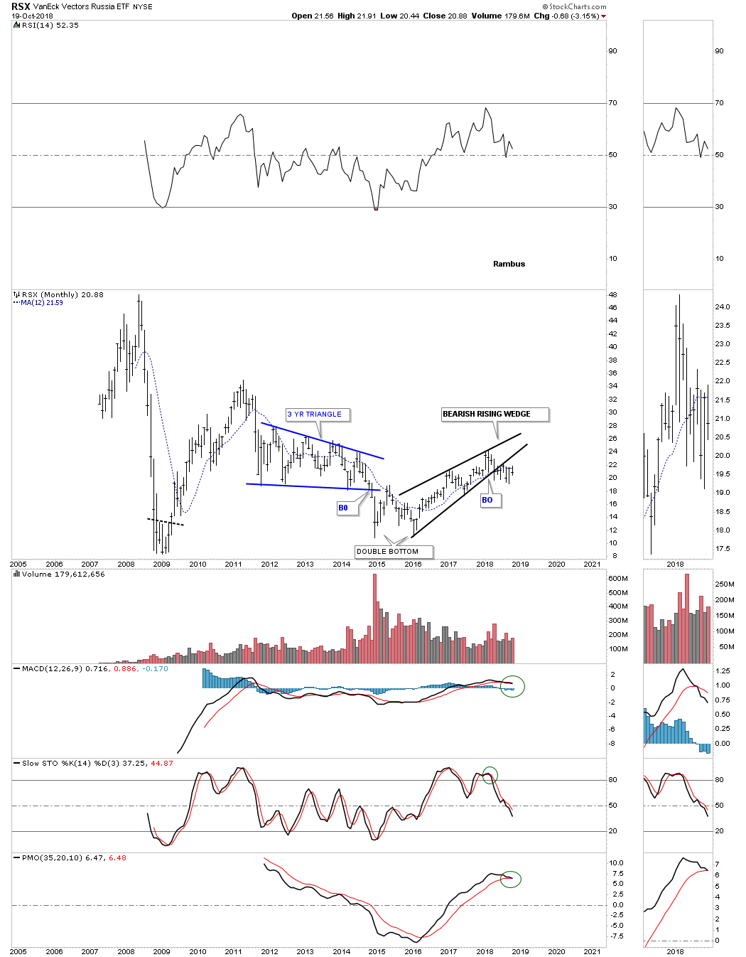
The RSX, Russian stock market, has been one of the weaker stock markets, but it has been making higher highs and higher lows since the 2016 double bottom low, but those higher highs and higher lows looks like they may have formed the black bearish rising wedge.
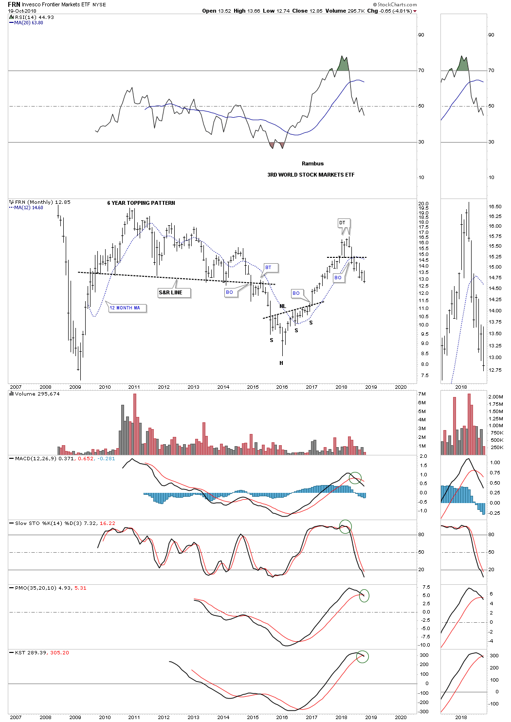
The FRN, third world stock market etf, made a good run out of its 2016 low but put in a small double top formation and has been one of the first to actually breakdown.
As many of these long term monthly charts above show there was a lot of deterioration over the last quarter. Trading below the 12 month sma isn’t the end of the world, but it strongly suggests to pay close attention to the markets. I will post part 2 tomorrow. All the best…Rambus
Quarterly Report “The Big Picture” Part 2 – October 21st, 2018
Different Sectors Within the Markets…
This is where we find out which areas within the markets have been doing the best or the worst. During a correction money tends to rotate from one area to another until each sector works on completing their consolidation phase. Some sectors will have a mild correction which is where the stronger stocks will be, while other sectors will experience a deeper correction which will shake a lot investors out of their shares.
How long these consolidation phases can last is one of the hardest things to figure out on the front end. Normally the bigger the impulse move the bigger the correction will be to consolidate those gains before the next leg up can begin. As we know there has to be at a minimum of four reversal points during the formation of a consolidation pattern. What can be hard on our patience is when there are six, eight or even more reversal points before the consolidation pattern is finally finished doing its job of confusing both the bulls and bears alike.
This Quarterly Report is showing much more weakness vs the last Quarterly Report. There are some important trendlines that are beginning to give way to the downside which may suggest that we could see a larger correction take place. If we see much more damage done we may even see a bear market within the secular bull market that began in 2009, which could be up to 20% of the secular bull market. After a nine year bull market a bigger correction than normally wouldn’t be out of the question.
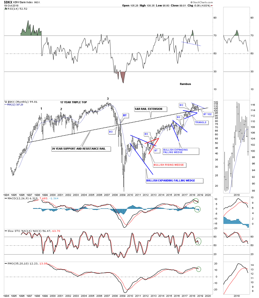
Lets start with the $BKX, bank index. In the last Quarterly Report, I suggested that the 20 year support and resistance line was very important and marked a line in the sand, above it was bullish and below is bearish. This month the price action is trading below that very important 20 year S&R line with a week and a half to go. For the bull market to continue the banks need to be positive which currently is not the case.
The $BTK, biotechnology sector, is trading close to a new all time high and still above its 12 month sma, but has a negative divergence on the RSI.

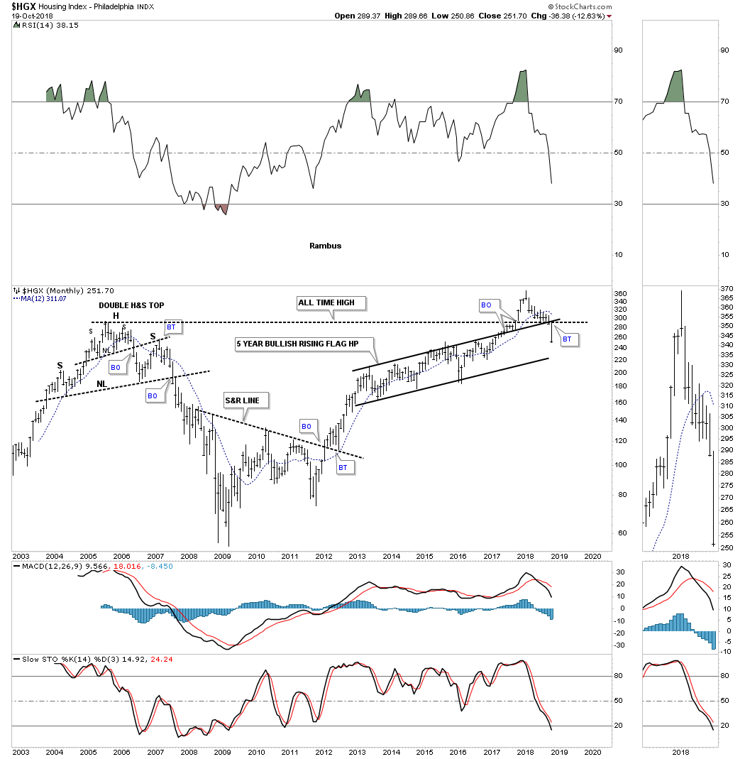
Next is the $HGX, housing index, which has really taken a hit this month trading back below critical support at the 2005 H&S top, and the top rail of its 5 year rising flag formation, which has now negated the June 2017 breakout. Again, this is an area which needs to show leadership during a strong bull market.
The XLV, health care sector, has been one of the hottest areas in the markets. It actually made a new all time high earlier this month and is trading above its 12 month sma.

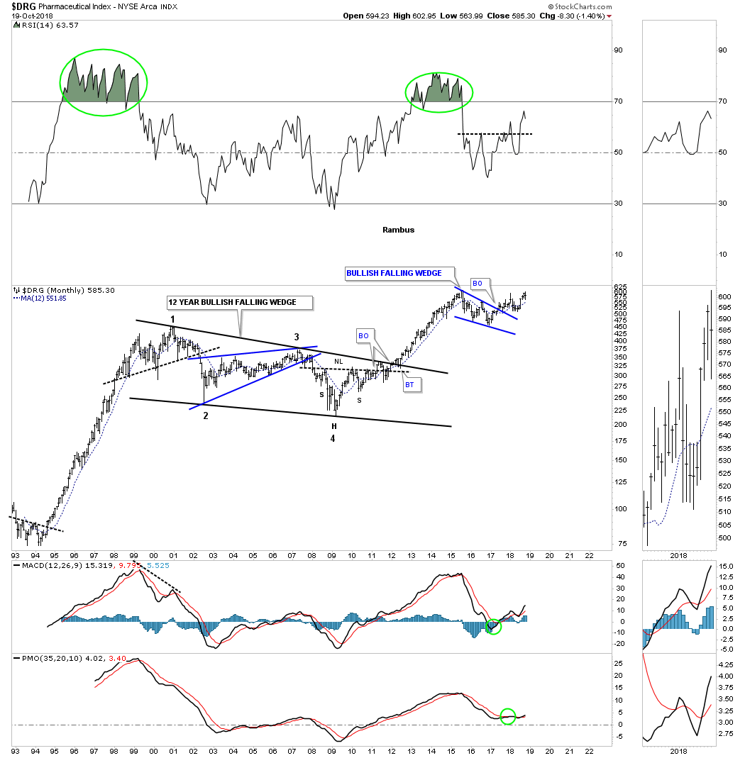
The $DRUG, pharmaceutical index, is also showing strength during this recent down market. It is very close to making new all time highs and is trading above its 12 month sma.
The XRT, retail sector, had been one of the strongest areas of the markets until this month when it began a strong move lower and is testing the bottom rail of its 2009 bull market uptrend channel and the 12 month sma. There is also the top rail of a three year triangle that is coming into play for support as well. A breakout below those critical areas of support would have bearish implications for this sector.

This next area of the markets that is giving me the most concern right now is the $SOX, semiconductor index. I posted this daily chart in the last Quarterly Report which was showing a large diamond pattern which had completed 7 reversal points, but there was no breakout in either direction so I suggested to wait and see how the large diamond matured. After completing 11 reversal points the one year diamond broke to the downside at the beginning of this month. I was waiting for a backtest to short it but so far there hasn’t been one.
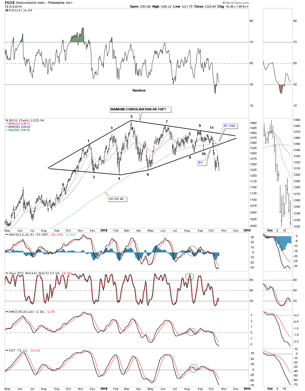
This weekly chart for the $SOX shows the price action of the one year diamond breaking down from the bottom rail of the diamond, the bottom rail of the 2016 uptrend channel and the 30 week ema. The bearish setup here is that the diamond fell just shy of completing the 11th reversal point which is bearish in its own right plus the diamond formed at the top of the 2016 uptrend channel. With an odd number of reversal points the diamond is a reversal pattern to the downside which is easy to see now.
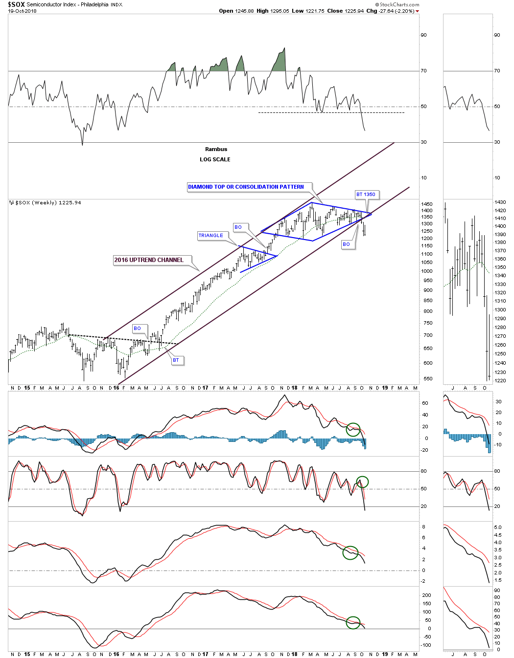
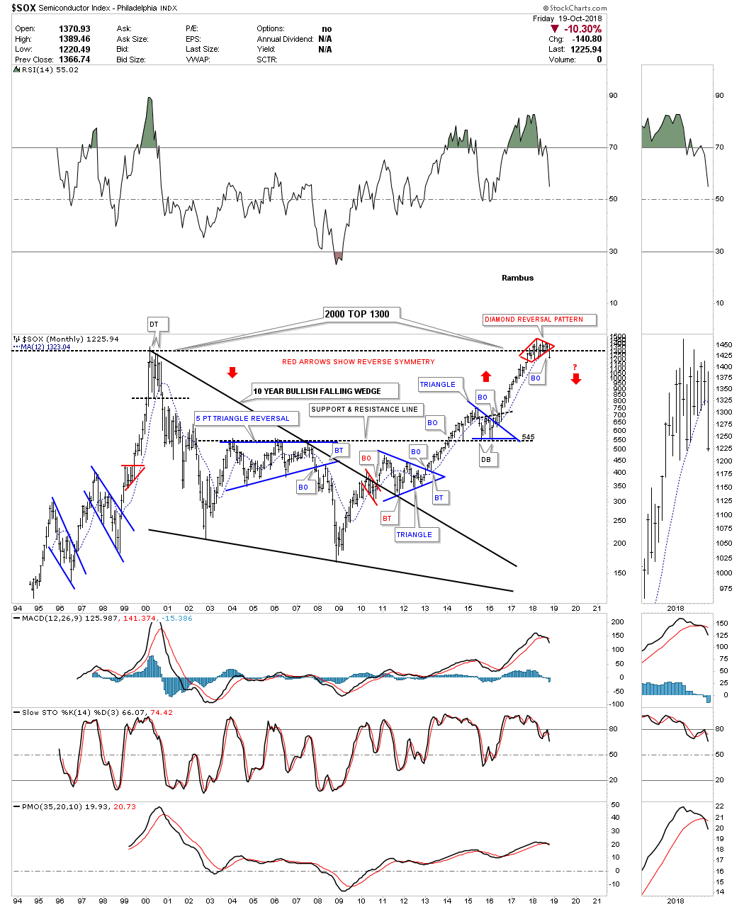
To put that one year diamond reversal pattern into the very big picture we need to look at the long term monthly chart with the 12 month sma. Reversal patterns just don’t form anywhere on a chart. They form at important turning points so where this one year diamond formed on the monthly chart is telling us it formed at the previous all time high made back in 2000. Normally it would not be unusual to see a smaller pattern build out just below, just above or right on an important trendline with the breakout being in the prevailing trend. In this case we have a fairly large diamond reversal pattern that is reversing the major trend. As you can see this is the first reversal pattern that has formed since the 2009 low. All the other trading ranges broke to the upside.
There is one last bit of information on this 25 year monthly chart and that has to do with reverse symmetry. Note the steep decline from the 2000 bull market high to the October 2002 low. Once the price action started to trade above the blue triangle in February of 2016 I suggested we may see some reverse symmetry to the upside based on the initial decline out of the 2000 high, as shown by the red arrows. It’s even possible that we could see some reverse symmetry back down over that same area as the 2016 rally because there were no significant consolidation patterns made on the way up.
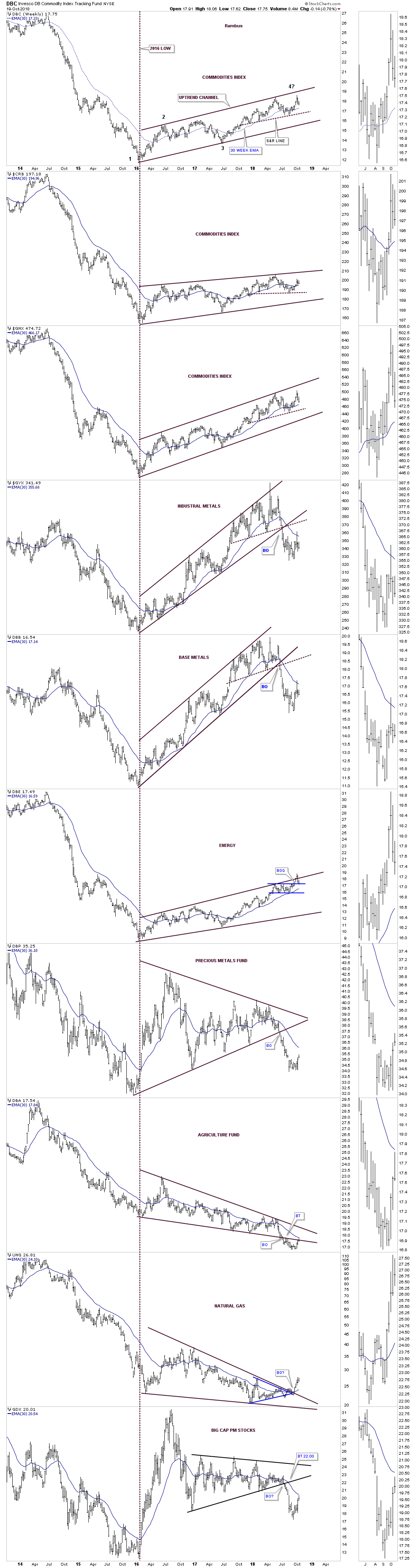
Commodity Combo Chart
Lets change it up a bit and look at a weekly combo chart which shows some of the different areas in the commodities sector. Since that important low in 2016 many different commodities have been trending higher in an uptrend channel with most hitting the top rail recently, which completes the third reversal point. It will take a move down to the bottom rail of the uptrend channels to complete the all important 4th reversal point. Then all it would take is a break below the bottom trendline to complete the flag or channel which would suggest a move down to the 2016 low as that is what these types of patterns measures out to. Once a rising flag or wedge completes their breakout the measured move is to the first reversal point in the pattern at a minimum. Sometimes the price action can go much further. You can use the DBC as a proxy for the other commodities related indexes as your guide.
Interest Rates
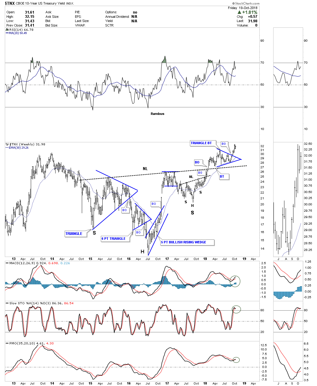
The $TNX, 10 year treasury yield, actually bottomed in mid 2016 and has been rising at a fairly strong pace except for the 2017 right shoulder / H&S bottom of the large three year H&S bottom. The blue triangle that formed just above the neckline as the backtest shows you a good example of how smaller consolidation pattern can form just below, just above or right on an important trendline and then breaks out in the direction of the prevailing trend. We saw just the opposite on the $SOX which reversed at its important overhead trendline.
Below is a combo chart which shows the yields rising on the 30 year and 10 year bonds beginning in July of 2016.
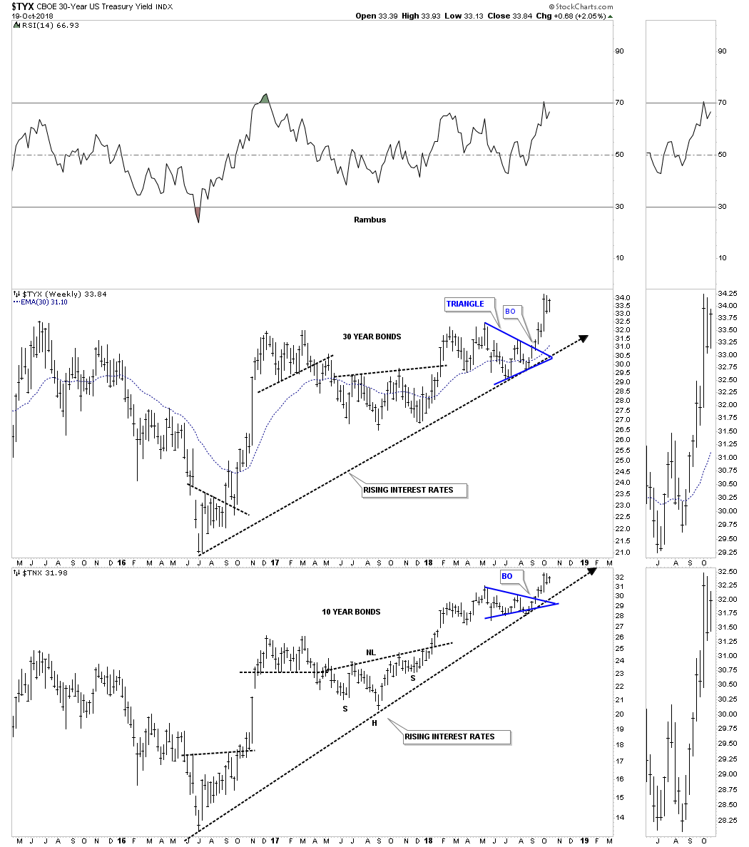
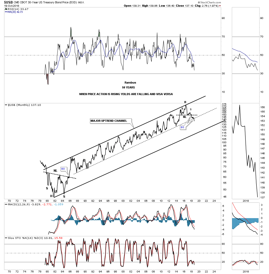
This next chart is a 50 year look at the $USB, 30 year bond. When this chart is rising interest rates are falling and vise versa. Note the large H&S bottom that formed in 1982 and our most recent one that formed in 2016. For over 30 years the price action traded in the upper channel of the rising uptrend channel. After all those years, this month of October 2018, the $USB has finally broken below that important mid dashed centerline. I can’t rule out a backtest to the mid dashed centerline, but the major uptrend has definitely been broken.
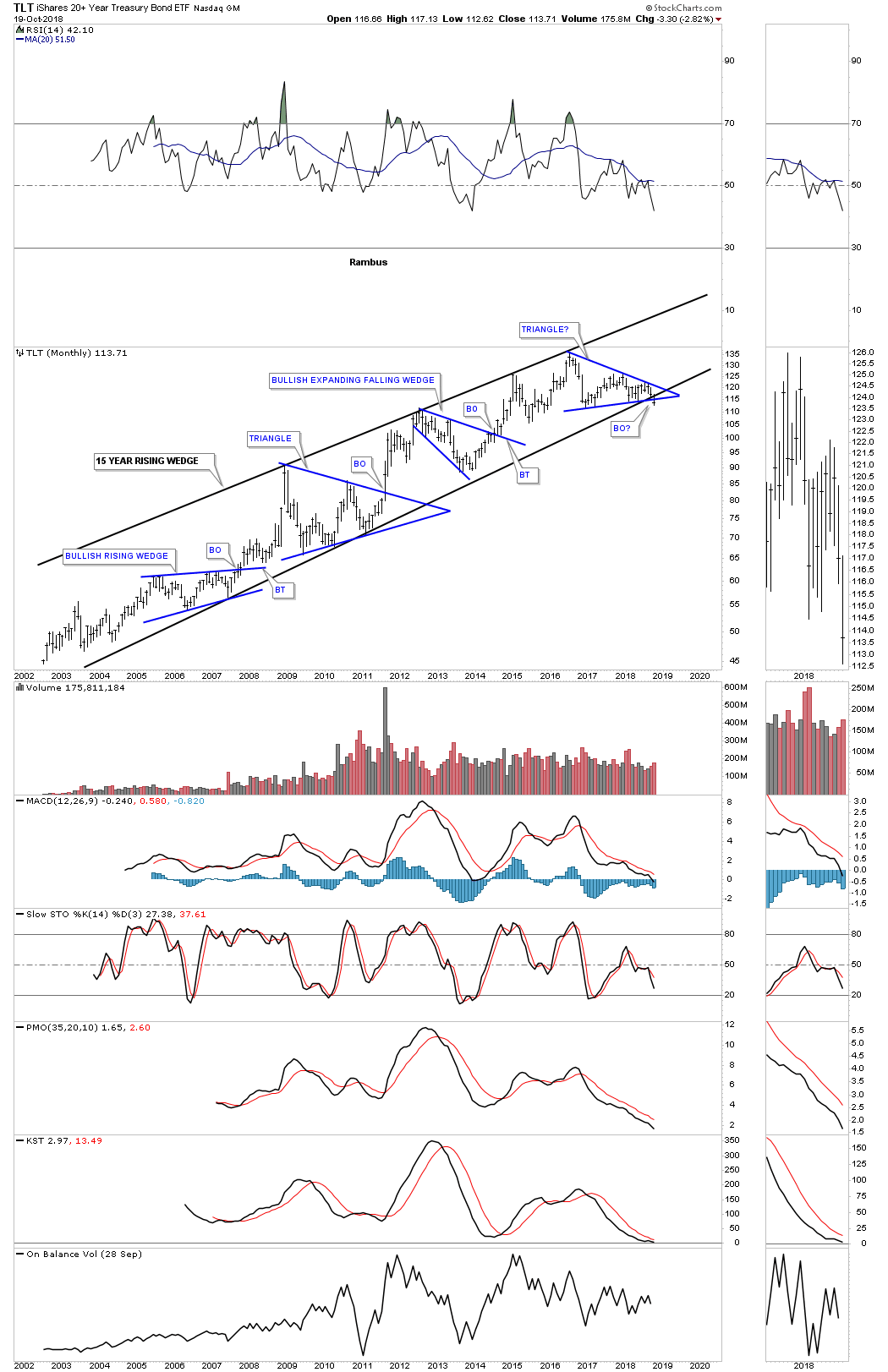
Next is the TLT, 20 year bond etf, which finally broke out to the downside from a double topping pattern. The bigger pattern is the four year H&S top, with the smaller reversal pattern being the 2016 five point triangle reversal pattern.

Below is a 4 1/2 year weekly look at the TLT which shows the 2016 five point triangle as a stand alone reversal pattern. A backtest to the bottom rail would come in around the 116.50 area. 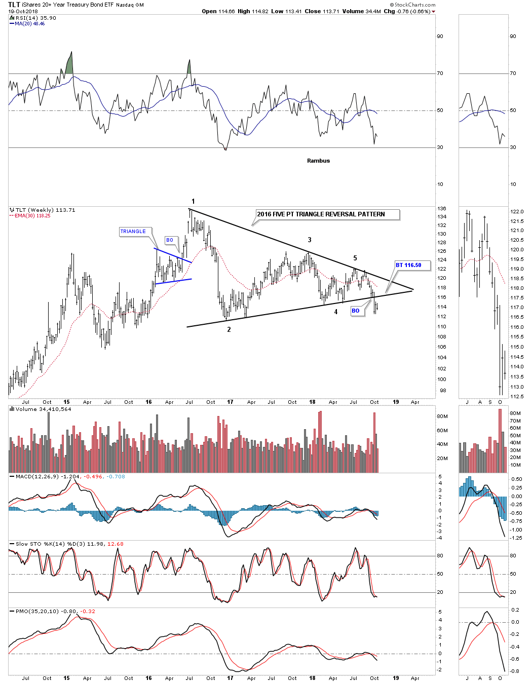
To put everything into perspective for the TLT, below is a long term monthly chart which is showing the breakout from the 2016 triangle reversal pattern, and the bottom rail of its bull market uptrend channel taking place simultaneously.
As many of these long term charts are showing the markets seem to be at an important inflection point. At a minimum it looks like an intermediate term inflection point. Once we get more Chartology to look at we will be able to determine if a major multi year downtrend will ensue. For now the charts are suggesting it is time to be cautious when it comes to the stock markets. Commodities in general still haven’t shown their hand yet in the longer term look while interest rates have reversed 35 years of falling interest rates. Currencies are still in their 2011 bear market while the precious metals complex is historically low, but needs a catalyst for them to finally move higher in a sustained manner. What will these charts look like in three months from now? Stay tuned as there is never a dull moment when it comes to trading the markets. All the best…Rambus
Wednesday Report… Comprehensive Currency Update – October 17th, 2018
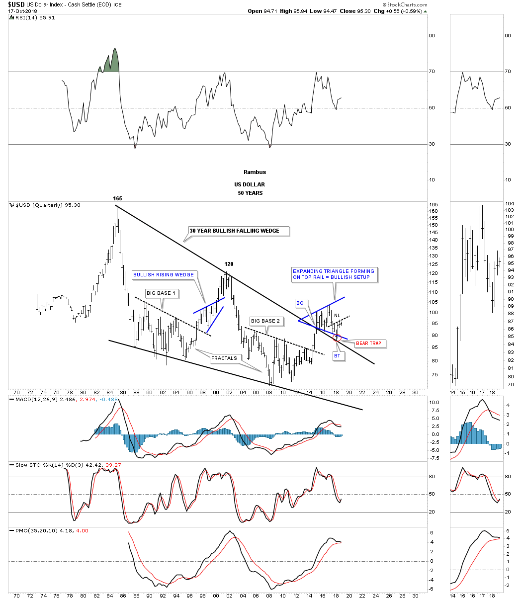
I think it’s a good time to update the currency charts as they are going to play a key role in many different areas of the markets going forward. If one wants to know what the US dollar is going to do they need to look at the different currencies that make up the US dollar. We can put all kinds of trendlines on the US dollar chart to try and figure out which way it is going to move in the intermediate to longer term time frame, but by looking at the charts that makeup the US dollar we’ll have better luck in determining its true intermediate to longer term direction. As always, keep in mind big patterns lead to big moves. I’m not going to spend a lot of time explaining each chart as we’ve been following them for a long time now, and with longer term charts changes come, but are slow. It’s when the price action is trading around an important trendline that we need to be vigilant.
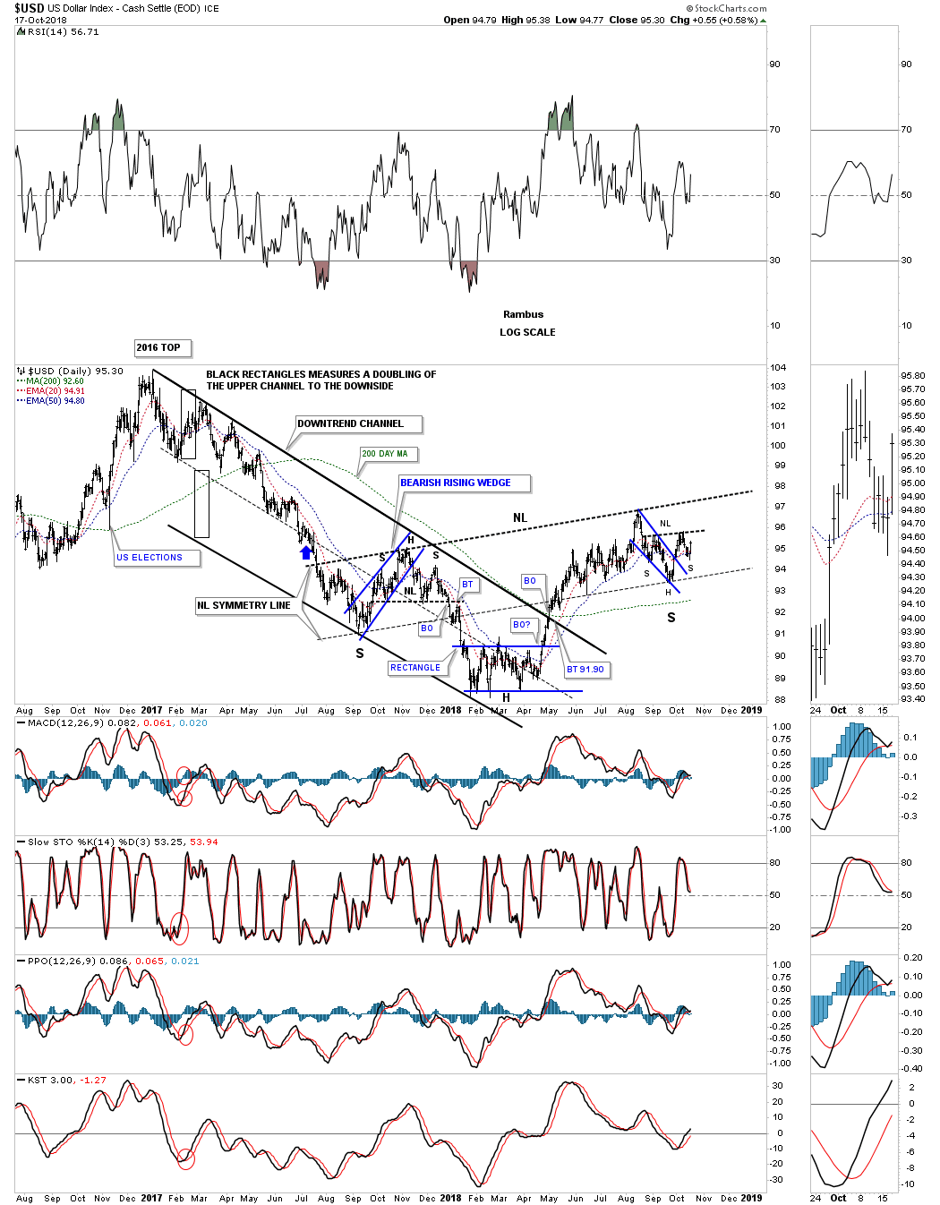
Lets start with a daily line chart for the US dollar which shows its 15 month H&S bottom is getting closer to completion. It still has some work to do, but a breakout above the right shoulder neckline will ensure a move up to the much bigger 15 month neckline. A breakout above the 15 month neckline will be a very big deal for the US dollar and all the areas that it affects on a longer term basis.
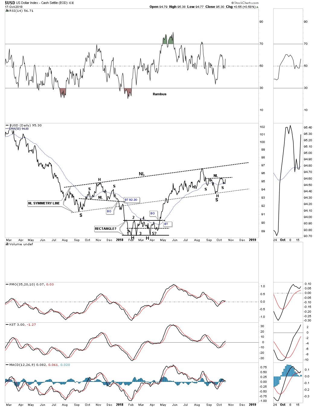
The US dollar topped out in late 2016 and began to build out a parallel downtrend channel that ended with the five point rectangle reversal pattern earlier this year. The US dollar enjoyed a strong impulse leg up which didn’t end until August which has led to the creation of the right shoulder armpit with the H&S bottom forming the possible right shoulder. If the large H&S bottom plays out it should add at least ten points to where the neckline is broken which would mean new highs for bull market that began in 2008. I know it doesn’t feel like it, but the US dollar has been in a bull market for ten years now and looks like it will have many more years to run.
This daily chart below shows a clearer picture for the H&S bottom.
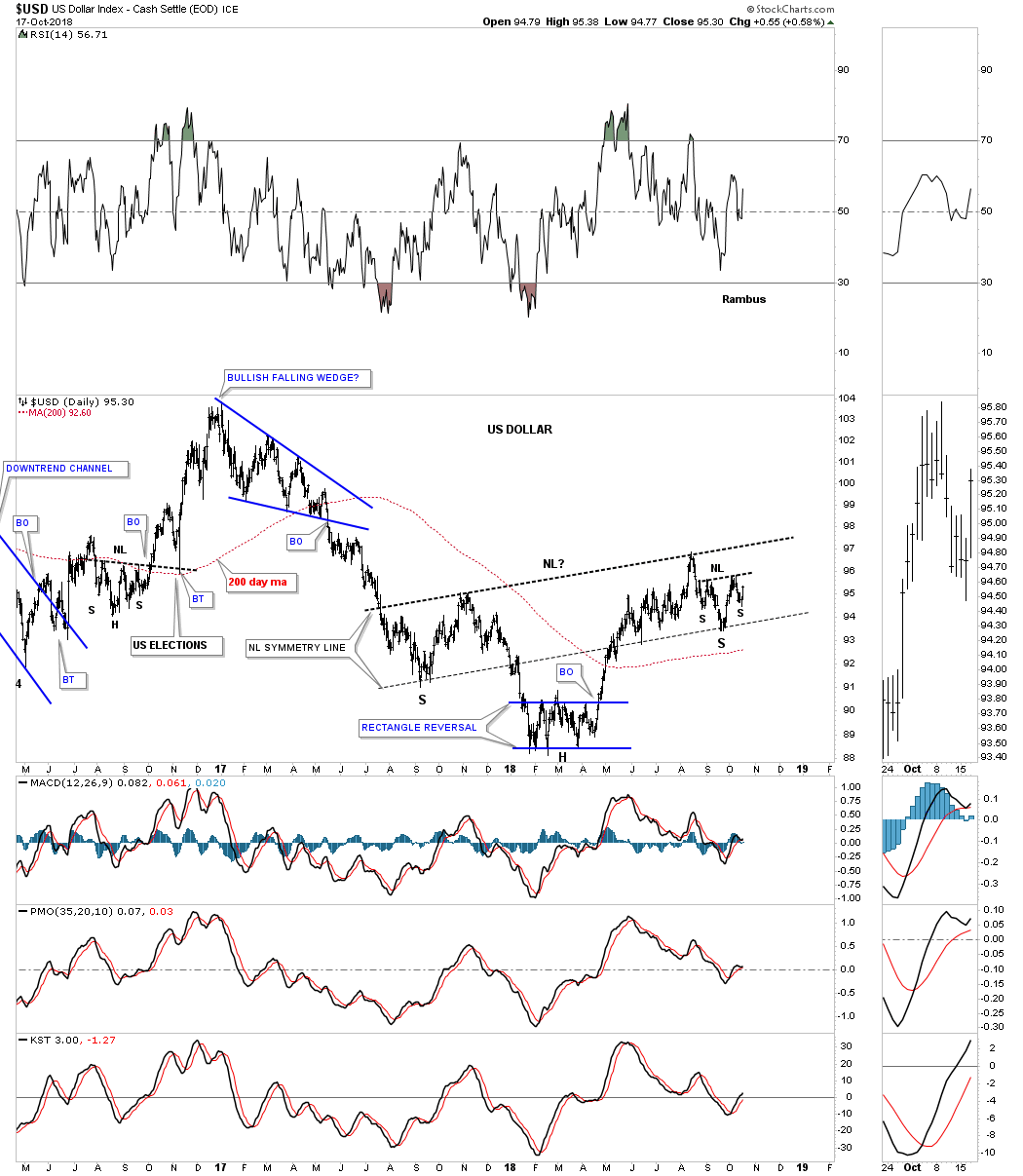
Some of you may remember this long term monthly fractal which shows big base #1 and big base #2 with big base #2 setting the stage for our current bull market. If you recall back in January of this year the US dollar was trying to shake the bulls off by trading below the bottom rail of the blue expanding triangle. It was a little frustrating at the time because it looked like a failed pattern. There was one last area of support which was the bottom rail of the new bull market uptrend channel that refused to give way, that’s when I put the red circle around the false breakout below the bottom rail of the expanding triangle and suggested it was a possible bear trap. You can see how the 15 month H&S pattern we’ve been looking at is forming on top of the bottom rail of the major uptrend channel, which is a good place to see a pattern like this build out.
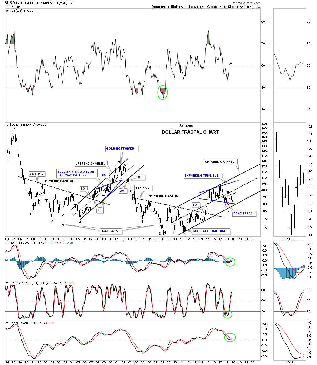
There was another reason I called the area below the bottom rail of the expanding triangle a bear trap its because the US dollar was also backtesting the top rail of the 30 year bullish falling wedge. Again, you can see how important our current 15 month H&S bottom fits into the big picture as the backtest.
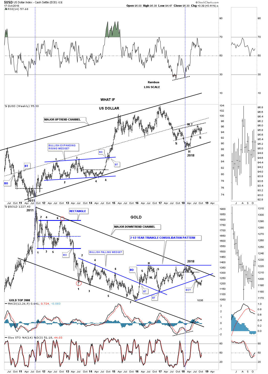
This next chart is a long term weekly combo chart which has the US dollar on top and gold on the bottom. Over time the inverse correlation becomes very obvious. It’s not always a perfect inverse correlation, but it’s the general trend of each we need to follow. As you can see the US dollar has been building out an uptrend channel while gold has been building out a downtrend channel since 2011, which is what you would expect over a long period of time. The US dollar bottomed out in 2011 while gold was topping out . Seven years later the US dollar was bottoming out while gold was topping out yet again. Here you can see how the 15 month H&S bottom fits into the big picture on the US dollar chart.
Below is the USDU which is a more balanced view for the US dollar. I’ve been following this potential bullish rising wedge since the initial backtest to the neckline. This is a very important chart to keep a close eye on as there are big consequences to the other non related US currencies especially if the potential bullish rising wedge plays out.

I mentioned at the beginning of this Wednesday Report that if we wanted to know what direction the US dollar was going to go over the intermediate to long term that we needed to look at the different currencies that help make up the US dollar. Below is a ten year weekly chart for the $CAD, Canadian dollar, which broke down from its 2016 bearish rising wedge formation in June of this year. Since the breakout, the $CAD has been building out the red flag just below the bottom rail as the backtest. Sometimes the backtesting process can be short and sweet and other times it can feel like an eternity.

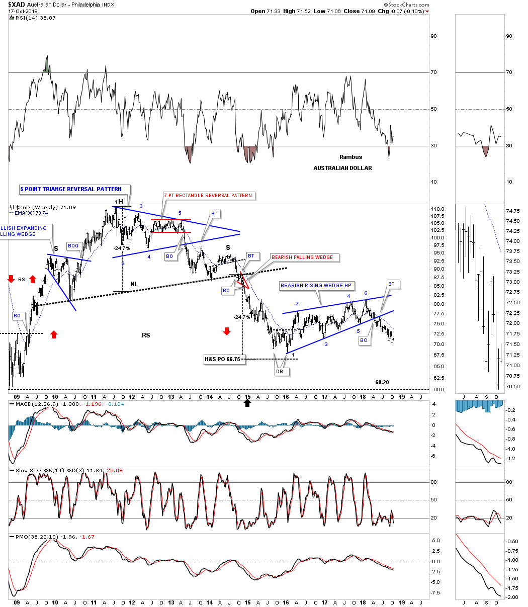
On the other hand when the $XAD, Australian dollar broke below the bottom rail of its 2016 bearish rising wedge it had a quick backtest to the bottom rail and then began to sell off continuing to make lower lows and lower highs.
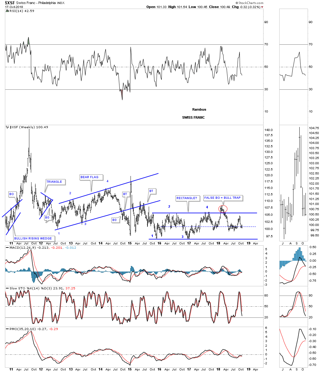
The $XSF, Swiss franc is setup a bit differently as it has been building out a two year rectangle consolidation pattern with a false breakout above the top rail signaling a bull trap.
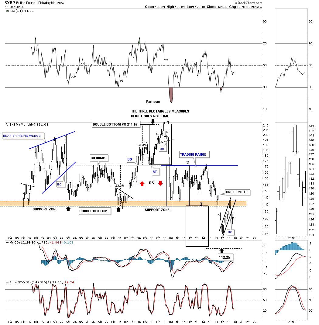
The $XBP, British Pound, has been one of the weaker of the important currencies when it broke down below its brown shaded support and resistance zone right after the BREXIT vote. So far it has only mustered up enough energy to backtest the brown shaded S&R zone from below which is what you would expect when a support and resistance zone is 30 years in the making.
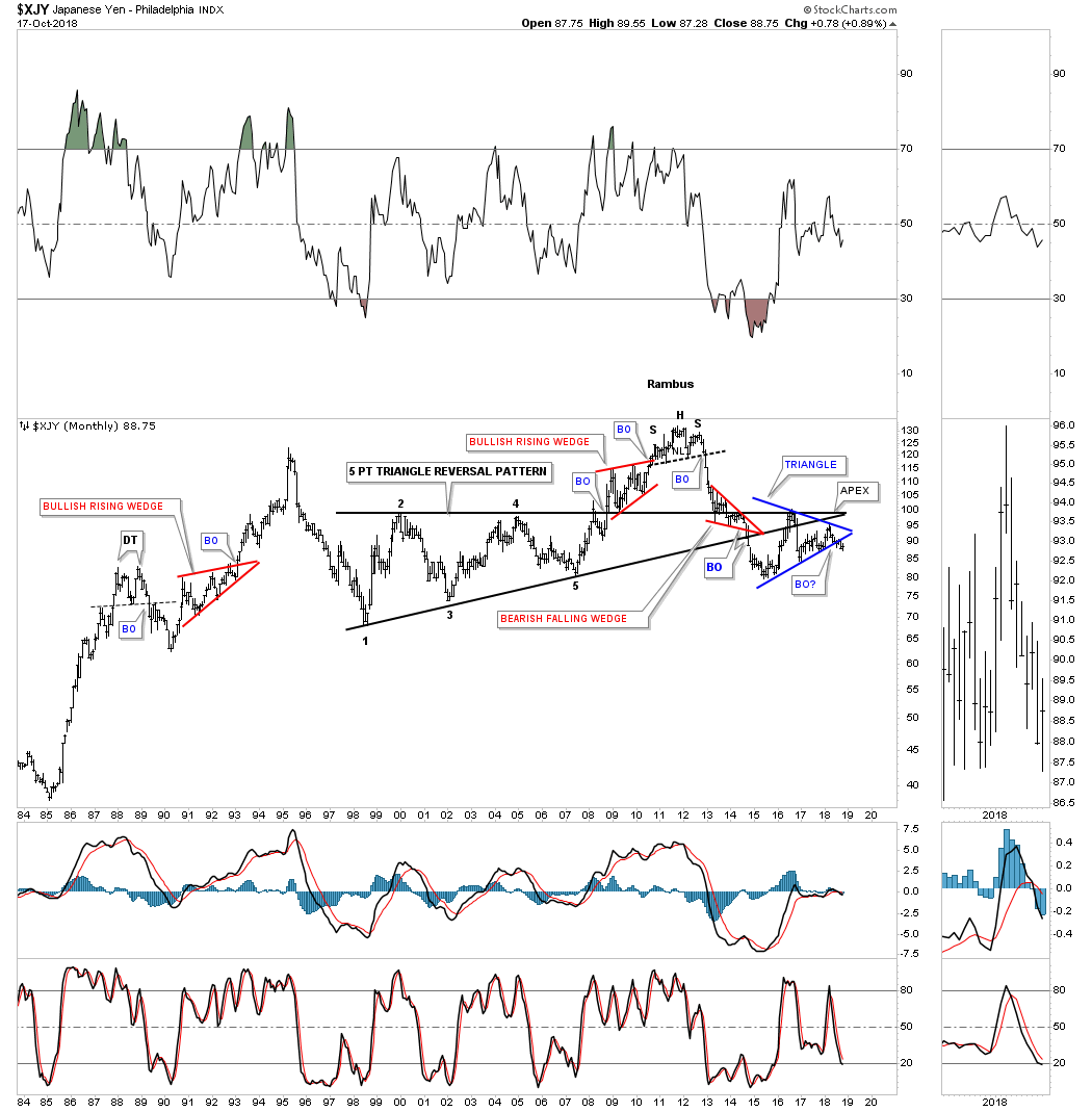
Lets take a closer look at the $XJY, Japanese yen as it has a pretty close correlation with the PM complex, as always it’s not perfect but close enough that we need to pay attention. The first chart is a daily look which shows the XJY breaking down below the bottom rail of its 2017 bearish rising flag, with the red bearish rising wedge forming the backtest to the bottom rail, which is similar to the little red bear flag we looked at on the $CAD, Canadian dollar.
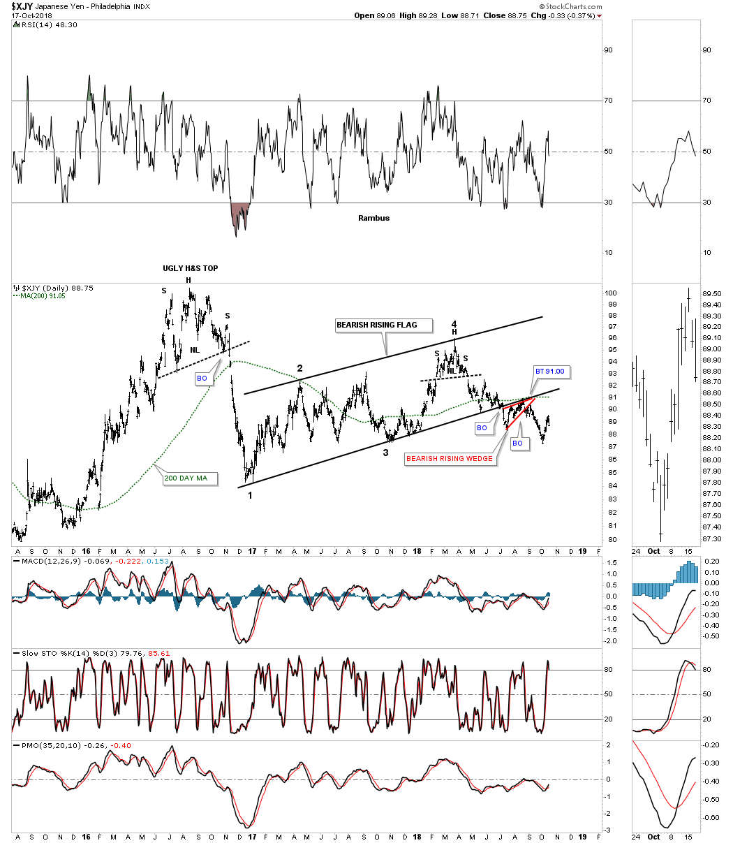
Stepping back a little further in time you can see the bearish rising flag on the daily chart above is part of a much bigger consolidation pattern, a three year black triangle. It took several months for the backtesting process to complete at 91, but looks like it may finally be finished.
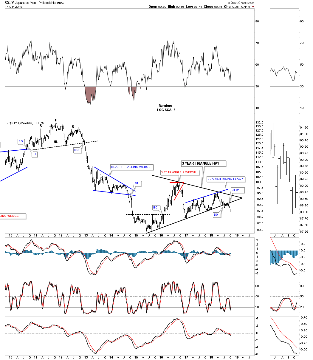
This last long term look at the $XJY goes all the way back to 1984 and shows some pretty nice Chartology. It’s 2011 H&S top isn’t near as big as some of the other currencies we looked at and for that matter many of the massive H&S tops that formed on the PM stocks in 2011, but it’s a reversal pattern nonetheless. The blue three year triangle consolidation pattern looks just like any consolidation pattern that forms during a bear market which the yen has been in since 2011.
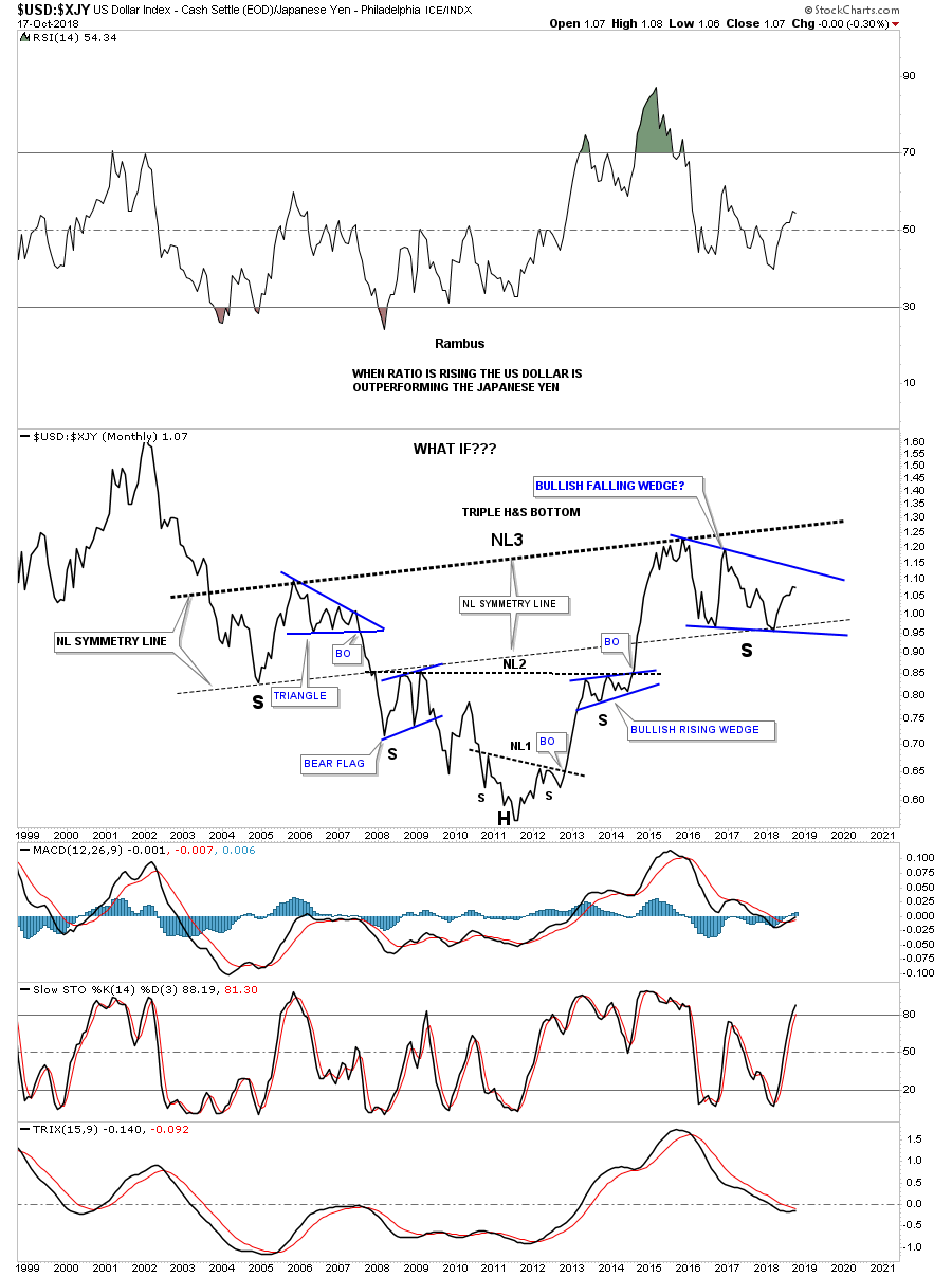
Below is a ratio chart we’ve been following which compares the USD to the XJY over the last 20 years. This is one of those, “WHAT IF,” charts. What if the triple H&S bottom plays out? How will that affect the PM complex? How high will the dollar get and what will that mean for commodities in general?
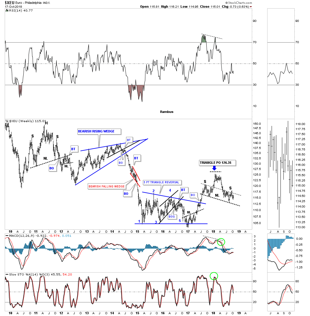
Last but not least lets look at some charts for the $XEU, euro, starting with a daily chart. If the US dollar is building out a possible H&S bottom then the odds are very high that the $XEU is building out a H&S top. The right shoulder on the US dollar is working with a H&S bottom, while the $XEU is working on a H&S top for its right shoulder, which is what you would expect.
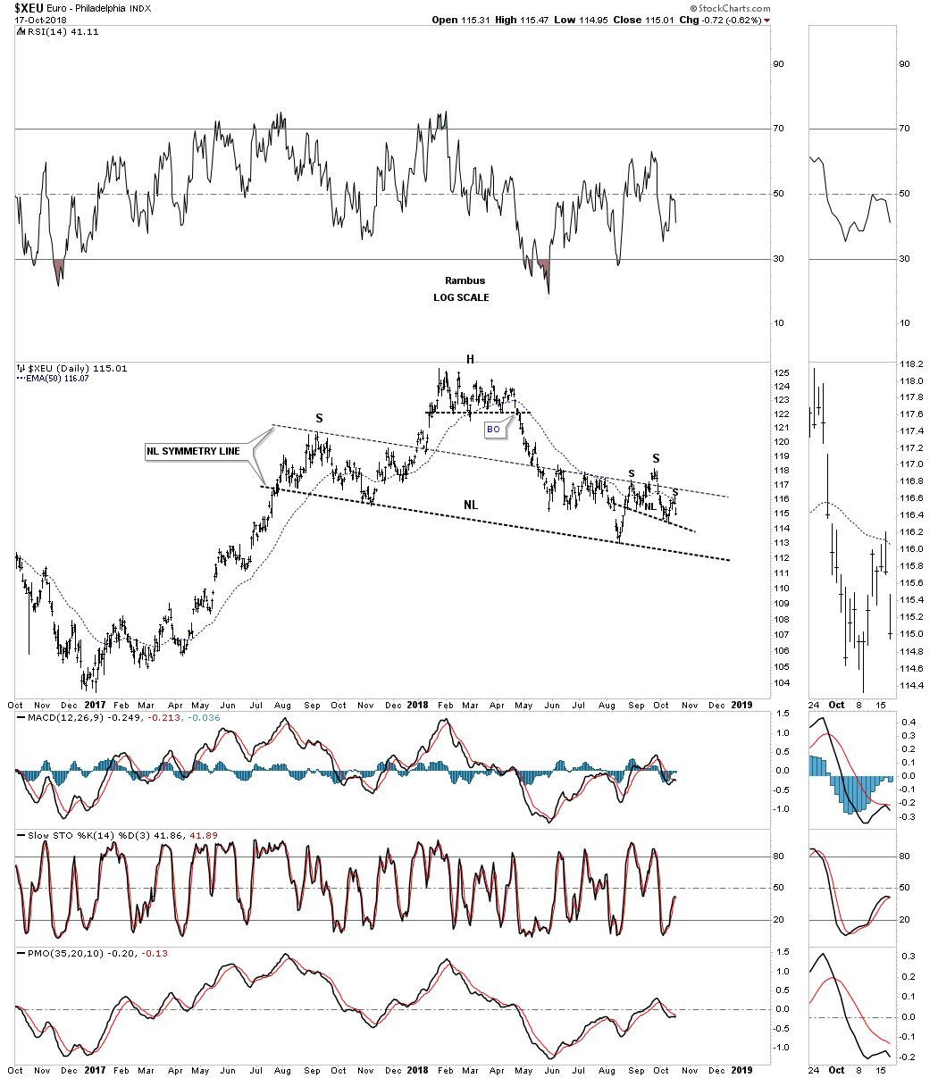
Here is a longer term daily chart we’ve been following which shows some nice symmetry for the left and right shoulders still in progress. Price wise they are the same height, and time wise the right shoulder is getting close to equalling the left shoulder.
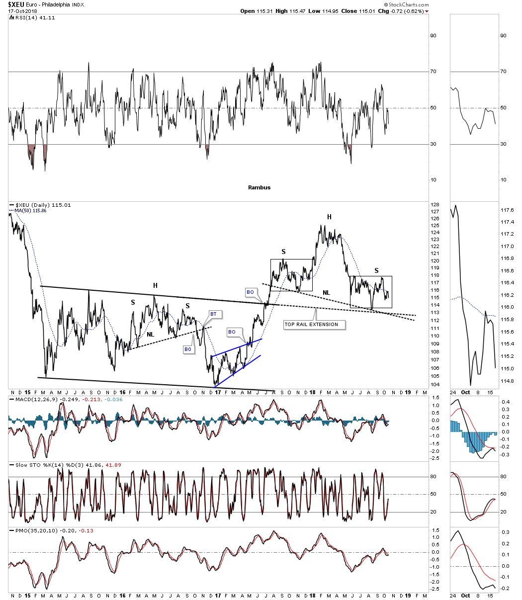
This weekly chart shows how the H&S top fits into the big picture which is just the opposite of the US dollar.
Earlier this year I posted the combo chart which has the $XEU on top and the $USD on the bottom. The first time I posted this combo chart both the XEU and USD were trading inside of their small red patterns. I asked the question, were the red trading ranges going to be a consolidation pattern or a reversal pattern? It’s looking like both red trading ranges are turning out to be heads of their 15 month H&S pattern. At any rate you can see the inverse correlation these two tend to have.
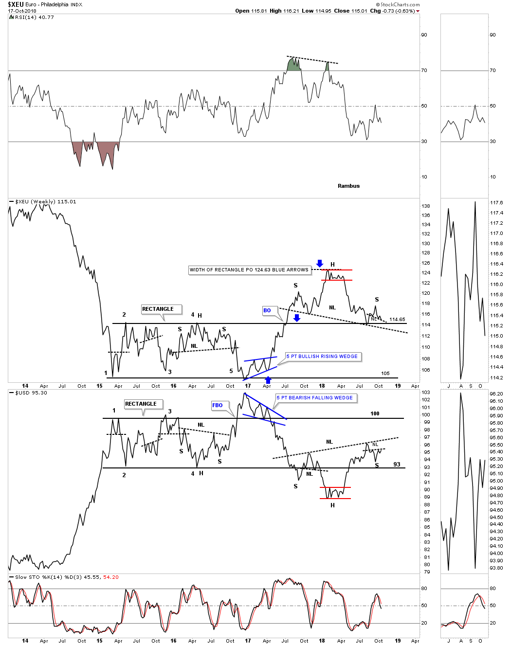
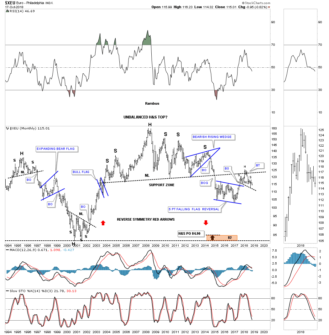
Then we have that massive H&S top which broke down below the neckline in December of 2014 signaling the H&S top was complete. There was even a breakout gap which is very rare on a monthly chart. For the last time , I promise you, note where the 15 month H&S top has formed, which is the backtest to that massive H&S top.
Is it just a coincidence that the 15 month H&S pattern that has been forming on the US dollar and the XEU is just random luck or is there more to it? As always we’ll know in the fullness of time, but if these H&S patterns complete they will be talking to us in more Languages than we can think of right now. All the best…Rambus
Weekend Report… Gold and PM Stocks – October 13th, 2018
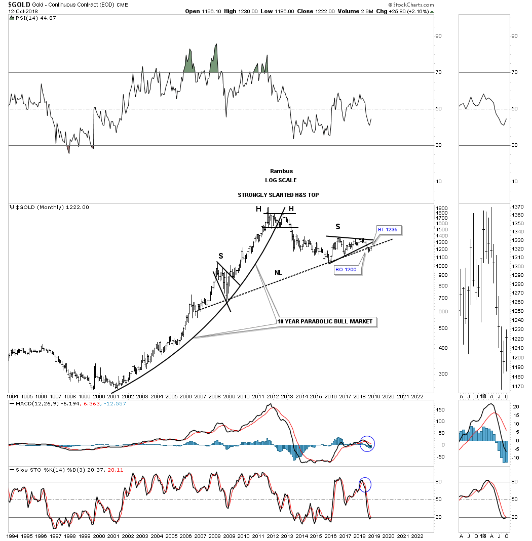
Last week we had some interesting price action in the PM complex which is showing a possible low from the impulse move down out of the early 2018 rectangle reversal pattern in gold. The big question is whether this low is just a short term low lasting a few day’s or a few weeks or something bigger like an intermediate to longer term low. Building an important bottom or topping pattern is a process that needs to unfold with important evidence that suggests a lasting longer term change is finally taking place.
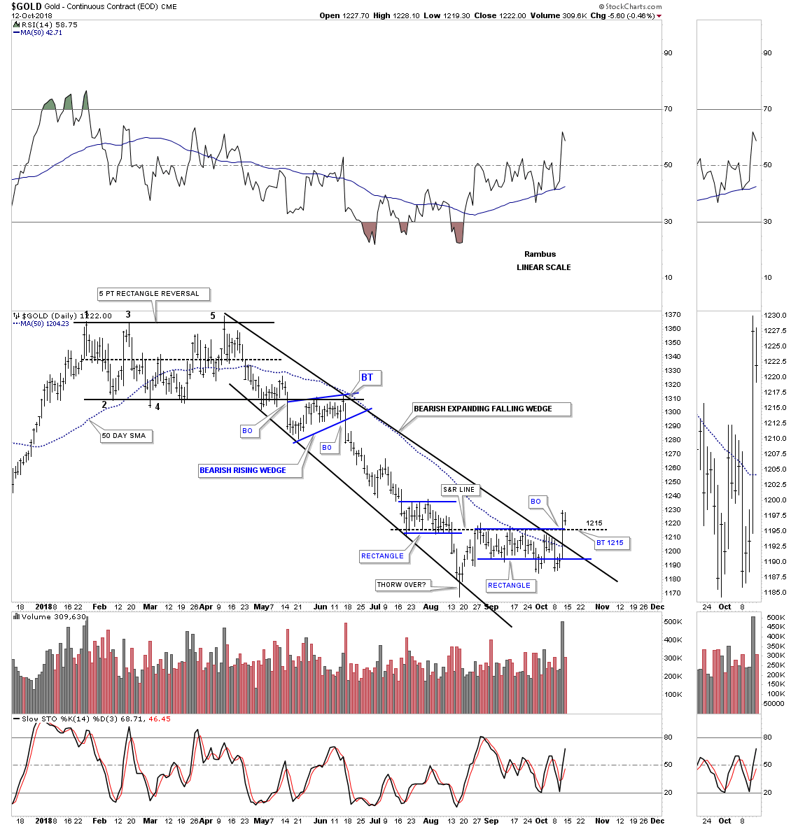
Lets start with a daily chart for gold which shows the decline from April 2018 to the August spike low in mid August. The last time we looked at this chart I showed three areas of overhead resistance. The first area of overhead resistance was the 50 day sma, the second was the top rail of the 2018 expanding downtrend channel with the third area being the top of the blue rectangle. Those three areas of overhead resistance were broken during last Thursday’s price action with a big increase in volume. The bulls finally showed us they may be gaining some strength for the first time is a while. The key for the bulls now is for the backtest to the top of the blue rectangle, at 1215 to hold support. If they can do that then they’ll have completed the first step of changing the April to August decline to a possible new uptrend.
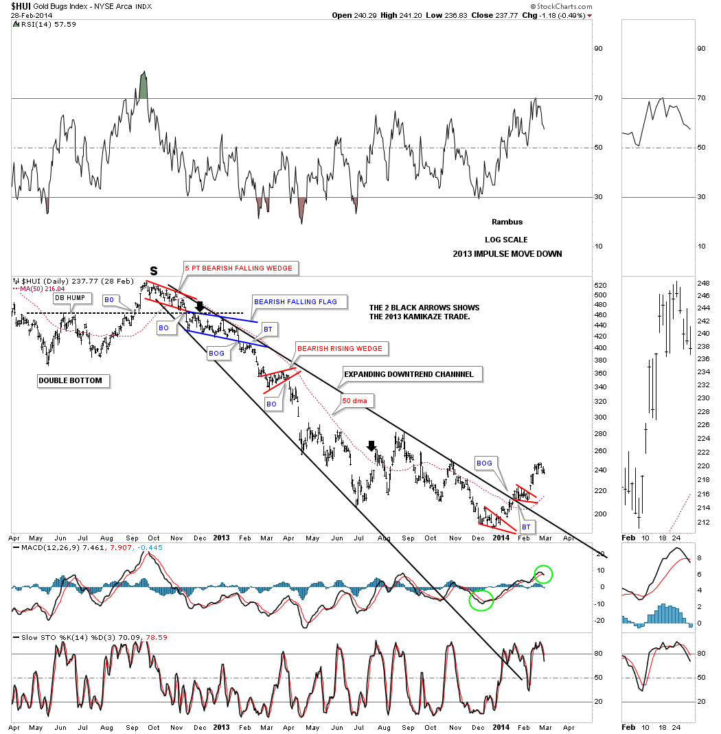
Before we move on I would like to show you a similar expanding downtrend channel we followed on the HUI back in 2013 when we were short the PM complex. Note the price of the HUI when it finally broke out above the top rail of the expanding downtrend channel which looked like the real deal. The HUI traded above the 50 day sma and gapped above the top rail of the expanding downtrend channel which looked very encouraging at the time. The breakout gap occurred in January of 2014 right around the 215 area. From the breakout gap area at 215 the HUI eventually declined 115 more points before it finally put in a bottom in early 2016 at 100 or so.
This next chart is the same daily chart for gold we looked at to start this post which shows a couple of more points of interest. If the backtest to 1215 holds support the next area of overhead resistance would be the December 2015 low at 1240. Above the 1240 low we have the fib retracements, red circles. So from a short term perspective the bulls need to overcome the 1240 area at a minimum to show they mean business.
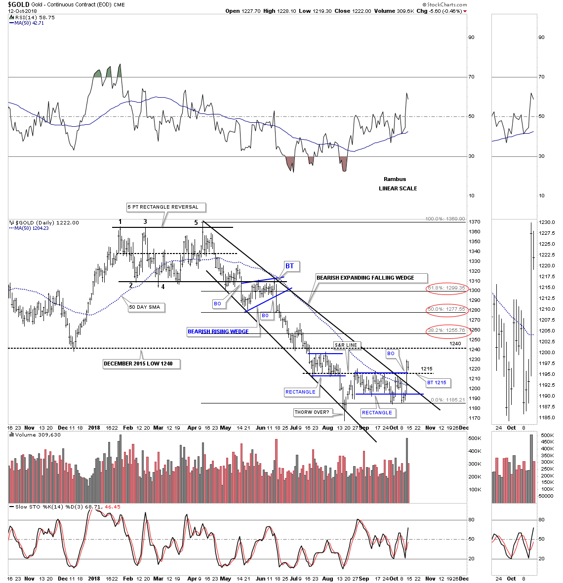
The dominate chart pattern for gold right now is the 2016 triangle consolidation pattern which broke down in June of this year at 1260. There was a two week backtest to the bottom rail at 1265 which confirmed for me the breakout was authentic and to be trusted. Gold declined 100 points to the recent low where it has been chopping sideways for the most part. As you can see there is a possible bear flag forming which won’t be confirmed until the bottom rail is broken, it’s only a possibility at the moment. If the top rail of the possible bear flag and the 65 week ema fail to hold resistance then the bottom rail of the 2016 triangle would be the last area of resistance which would come into play around the 1300 area as a second backtest.
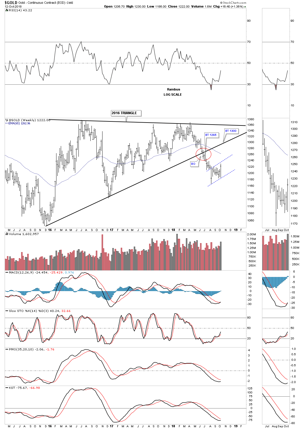
This next long term weekly chart for gold shows its 2011 bear market downtrend channel with the 2016 triangle which broke down in June of this year. Major resistance on this chart would be where the bottom rail of the 2016 triangle and the top rail of the 2011 bear market downtrend channel intersects at the 1300 area.
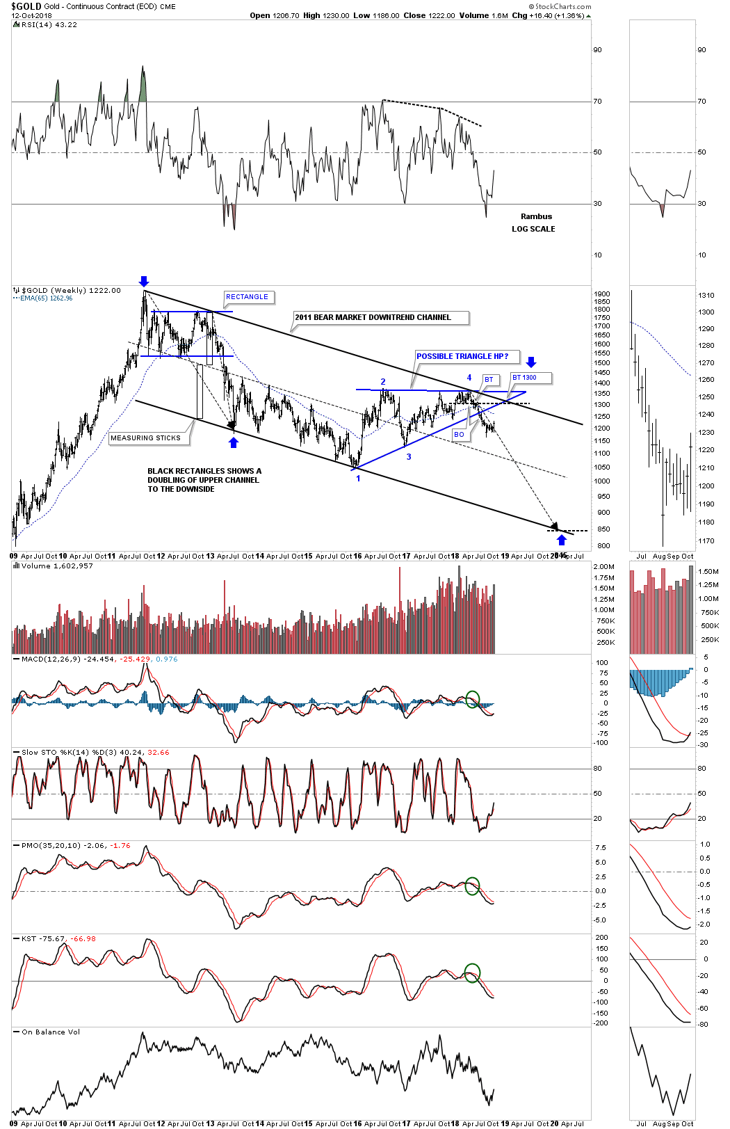
This last chart for gold is the long term monthly look which shows the possible massive H&S top. There are two important areas of overhead resistance, one at the neckline at 1235 with the second one on the backtest to the bottom rail of the 2016 triangle consolidation pattern. If that massive H&S top neckline fails to hold resistance then the bulls will be talking to us.
I know how important it is for most investors to want to be the first one to call a top or bottom. Calling a bottom in gold since the bear market started in 2011 has been tough for those making the call. If the December 2015 low is the beginning of the next bull phase then you haven’t missed much yet if you look at the price action below the massive H&S neckline. If the original bull market is going to continue then there will be many years of bullish price action ahead of us, but being stuck in a bear market can be very difficult, emotionally at best.
Next I’m going to post some long term charts for the stocks that make up the $HUI to see if they can give us any clues on the long term direction for the HUI. There is a lot of nice Chartology on these charts which shows reversal, consolidation patterns, and impulse moves.
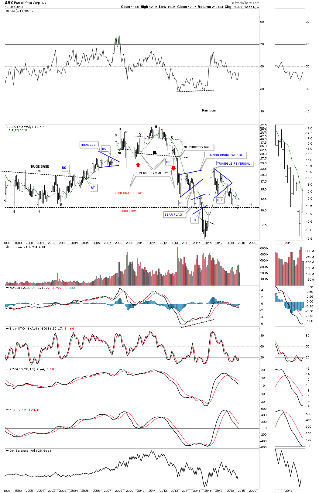
This first chart is for the ABX which is bouncing off its 2000 bear market low after breaking down from its blue five point triangle reversal pattern one year ago in October of 2017.
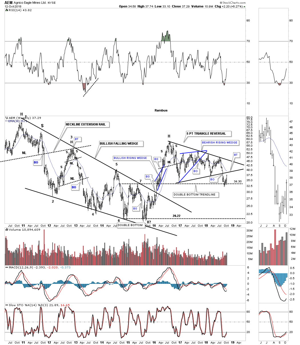
This next chart is a weekly look at AEM which built out a black five point triangle reversal pattern beginning at its 2016 high. It’s currently doing a ping pong move off the double bottom trendline with the bottom rail of the triangle reversal pattern just above the current price action.
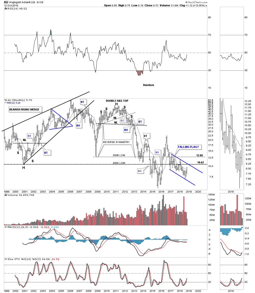
Below is a 20 year monthly chart for AU which is building out a falling flag formation below its 2000 low, but is trading above its 12 month sma.
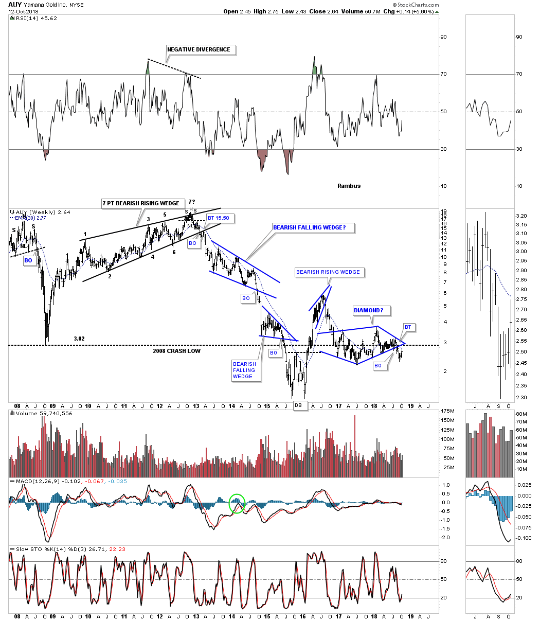
About six weeks ago AUY broke below the bottom rail of a six point diamond and is currently backtesting the bottom rail and the 30 week ema.
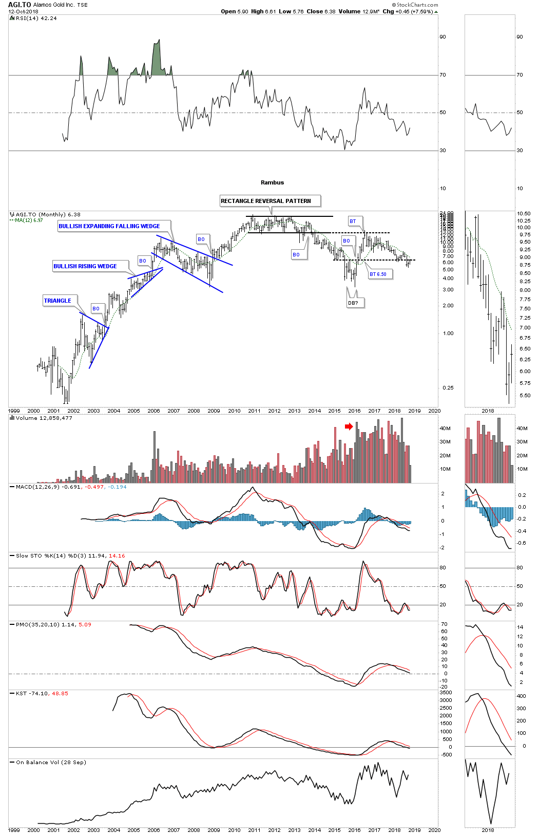
This long term monthly chart for AGI.TO shows it was a good producer of chart patterns during its 2000 bull market. Instead of a H&S top in 2011 like many of the PM stocks made AGI.TO built out a seven point rectangle reversal pattern to end its bull market.
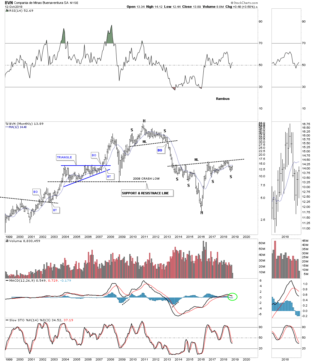
BVN has potentially one of the stronger long term trading ranges which is a the possible H&S bottom that began to form back in 2013. One to keep an eye on.
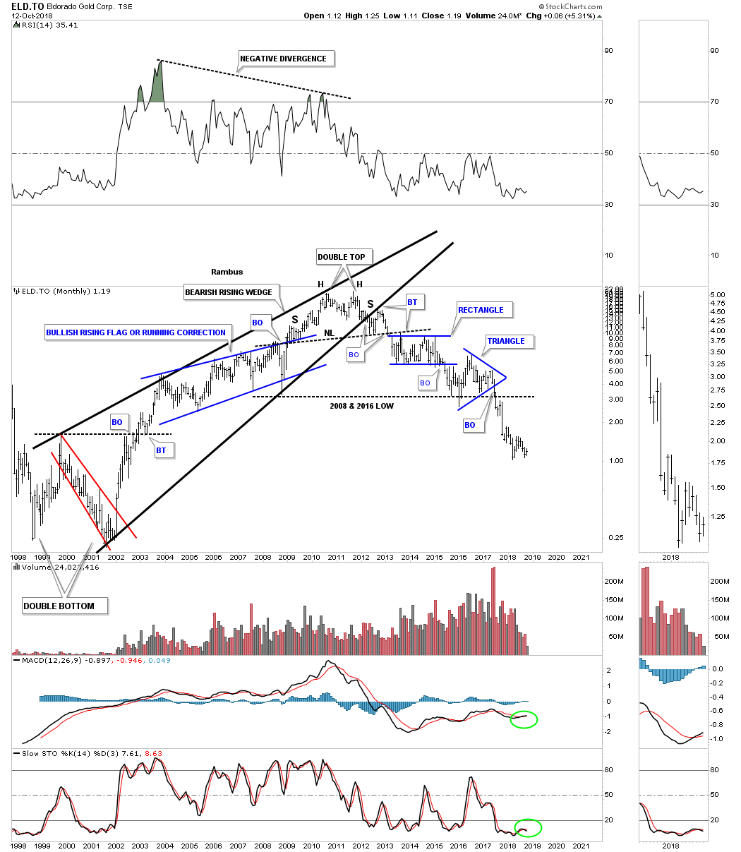
After building out a classic H&S top in 2011, with the left shoulder and double head forming inside the rising wedge, with the right shoulder high forming on the backtest to the bottom rail, ELD.TO has been in a strong decline trading below its 2008 and 2016 lows.
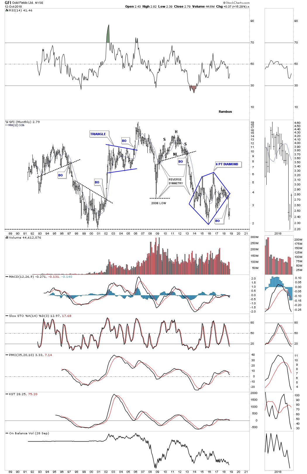
GFI showed some nice reverse symmetry to the downside when the price action broke out below its 2011 H&S top. Three months ago GFI broke down from a six point diamond.
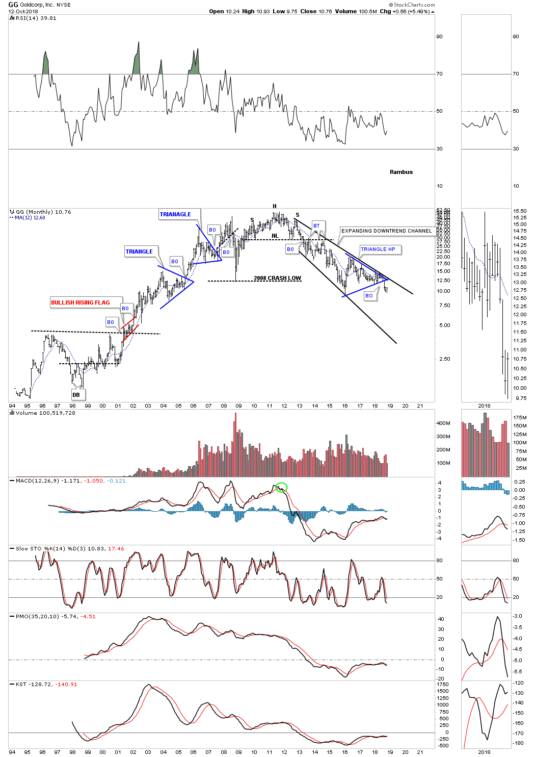
When all the H&S tops that formed back in 2011 GG was one of the last to finally break below its neckline. From the right shoulder high GG has been trading in an expanding downtrend channel breaking below the bottom rail of the blue triangle.
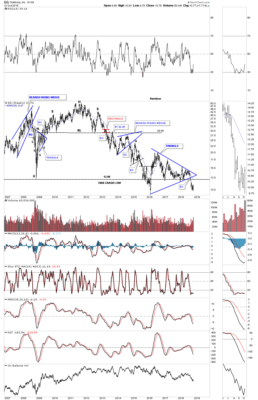
The weekly chart shows the blue triangle a little bit better with the price action still trading below its 2008 crash low.
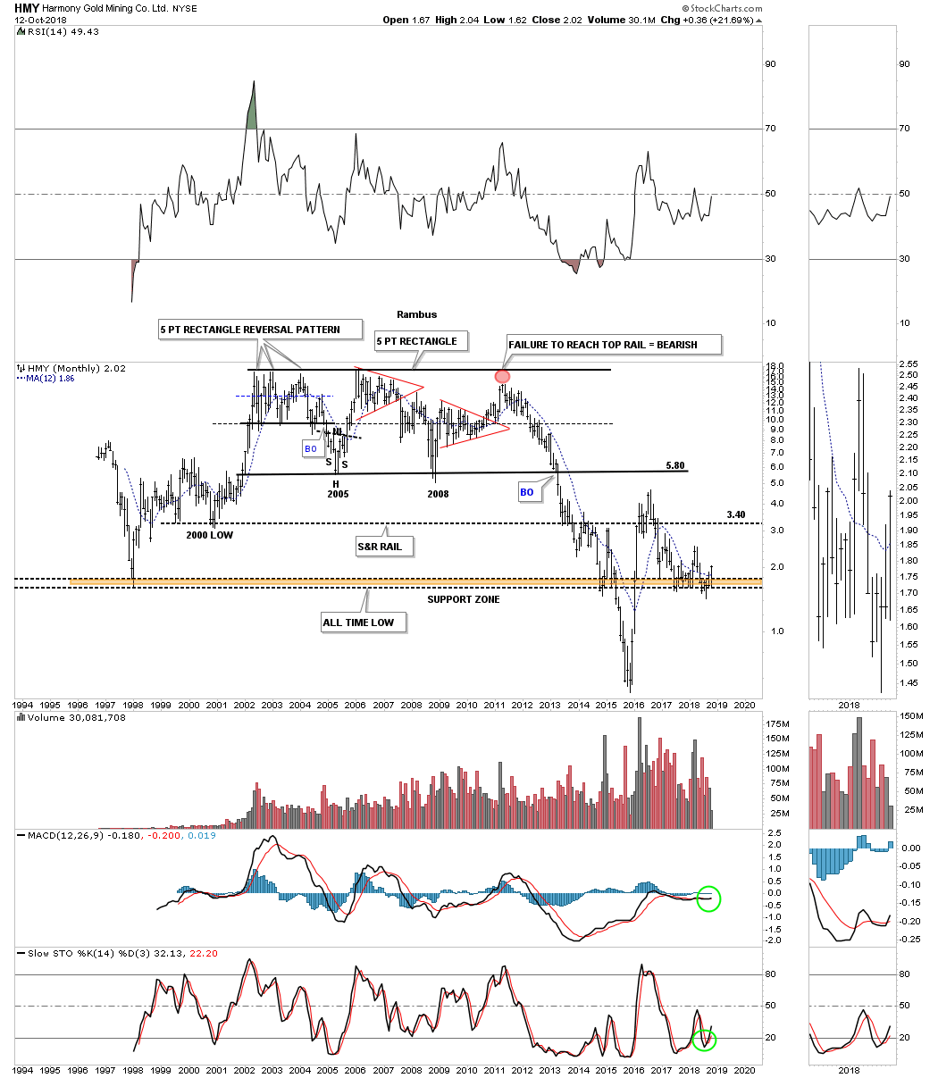
After breaking down from new all time lows back in 2016 HMY enjoyed a strong countertrend rally up to its 2016 high. You can see how badly this stock has preformed since it broke out below the bottom rail of its ten year rectangle. In 2013 the price action broke below the 2005 and 2008 crash low and then went on to make new all time lows in 2016. HMY is currently finding some support at the brown shaded S&R zone at its 1998 low.
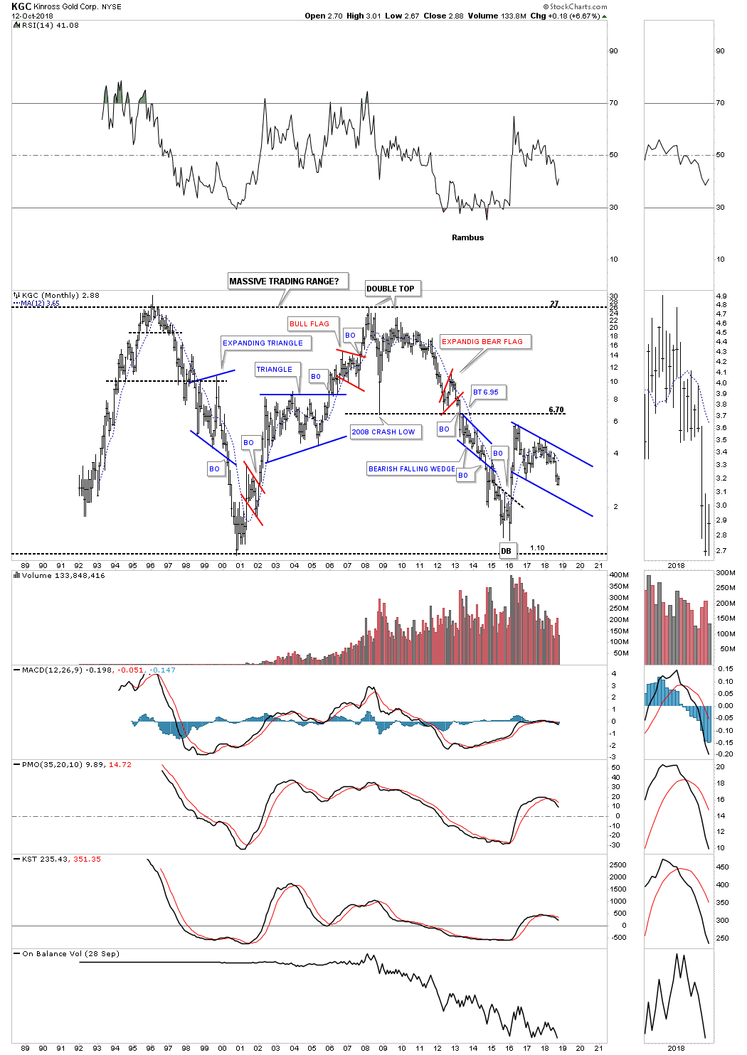
KGC has been around a long time and is currently trading inside of the blue falling flag.
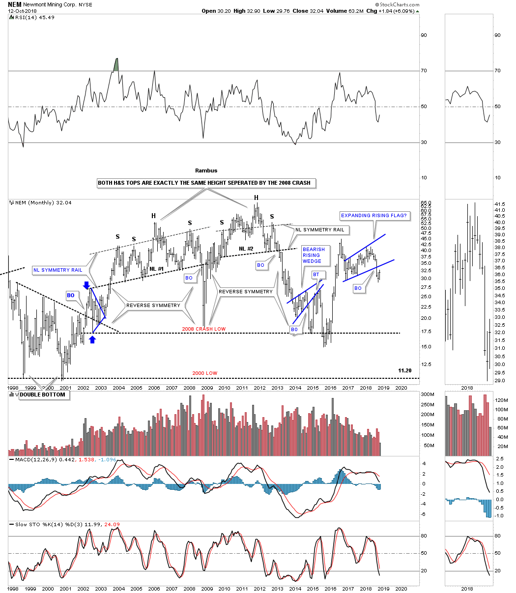
NEM is another big cap PM stock that has been around a long time. Three months ago it broke down from an expanding rising flag formation and is in the process of backtesting the bottom rail.
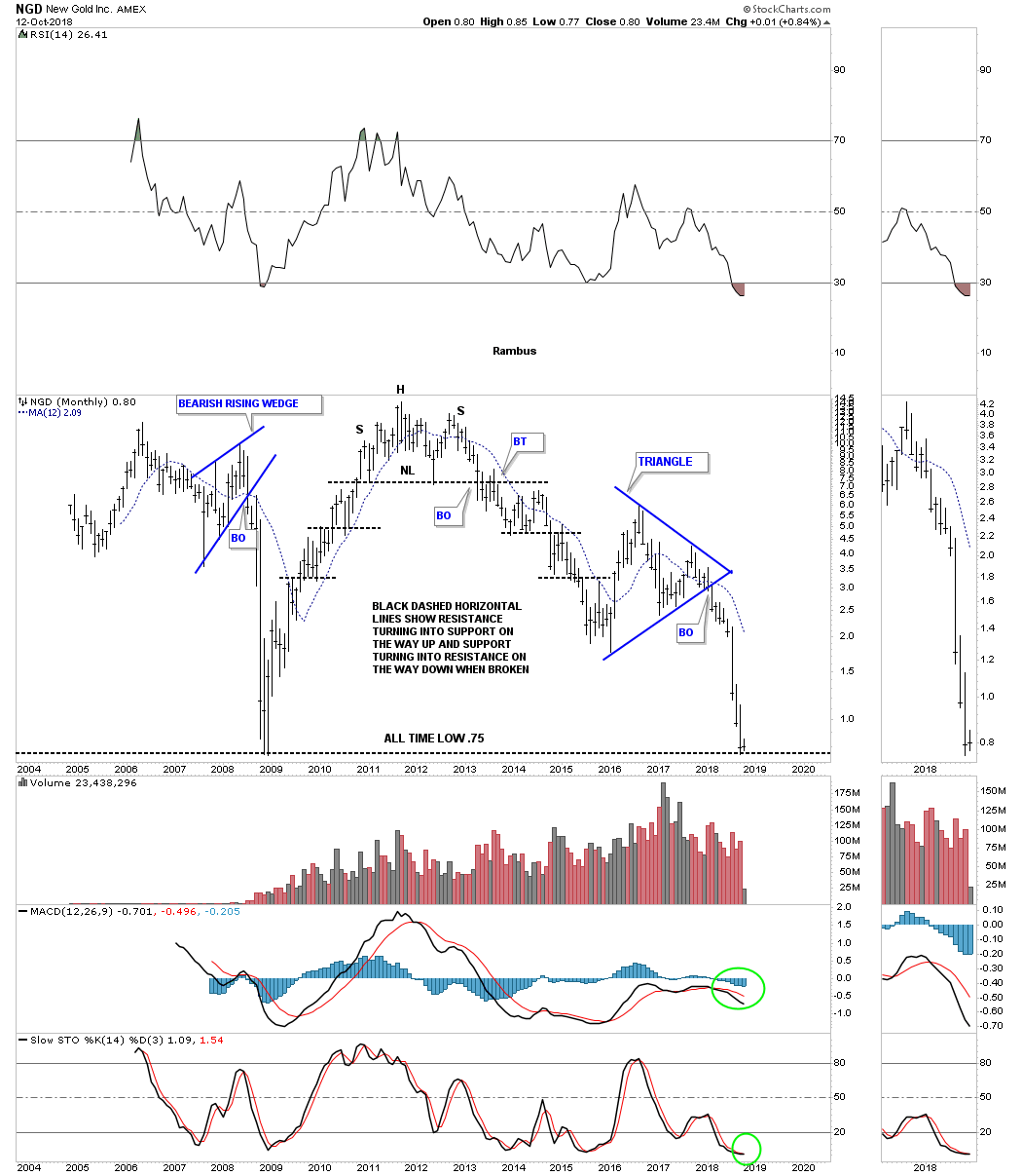
NGD fell on hard times when it broke below the bottom rail of its blue triangle consolidation pattern in February of this year. It’s currently testing support at its all time low.
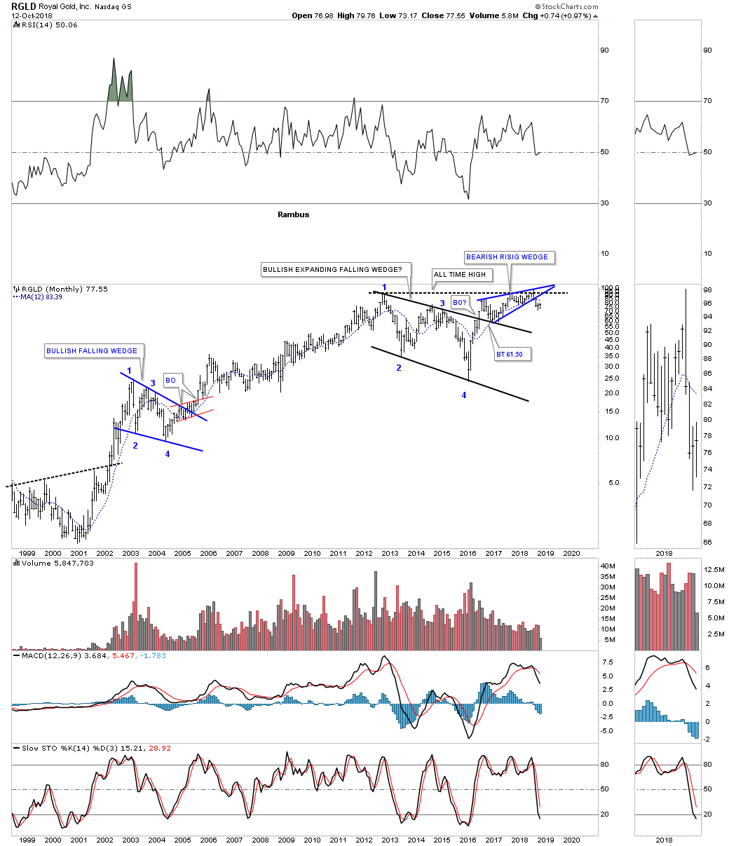
RGLD has been one of the strongest PM stocks of them all but it has recently broken down from a bearish rising wedge in July of this year.
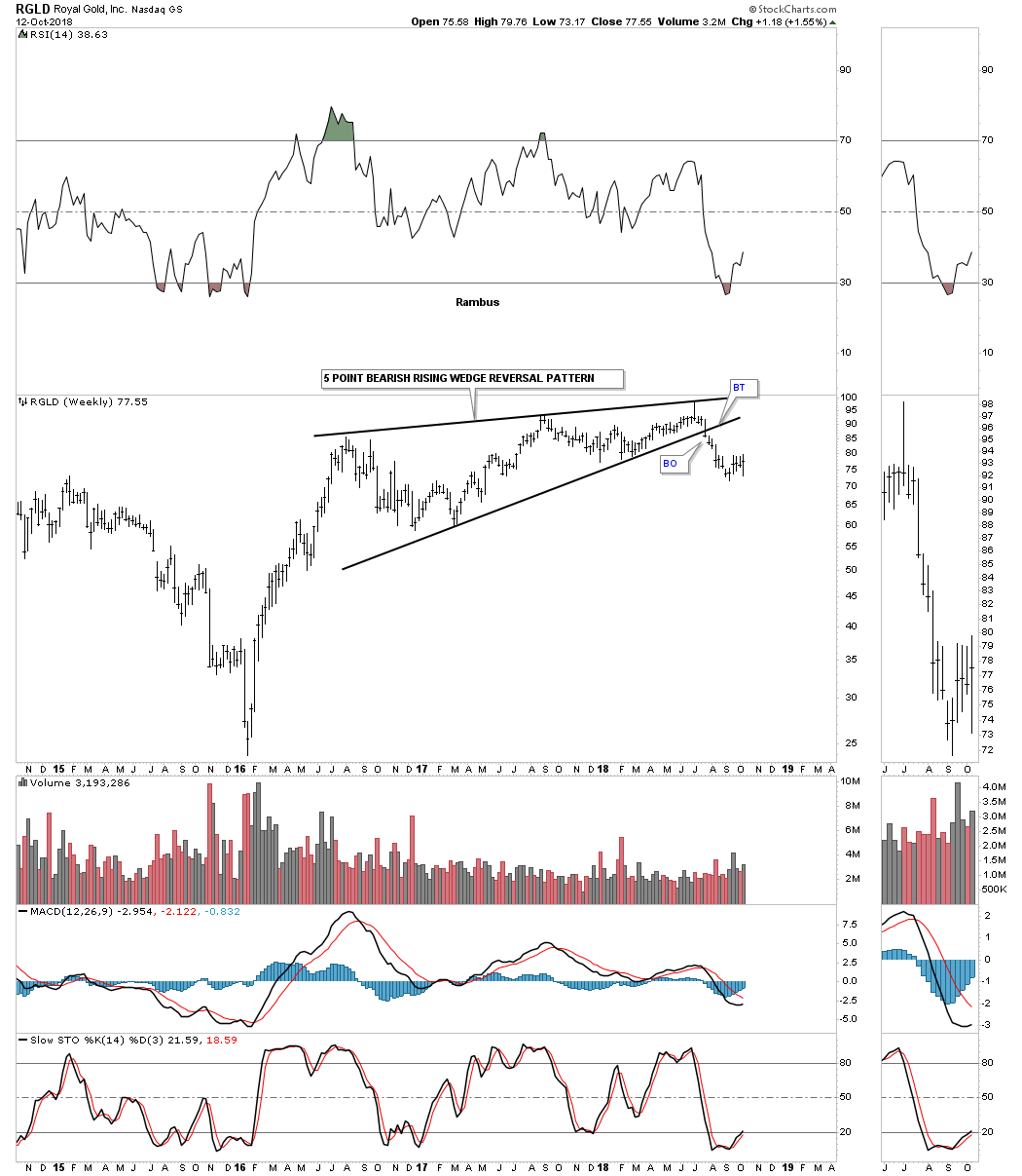
The 20 year monthly chart for RGLD shows just how strong this stock has been and how the rising wedge built out just below its all time highs.
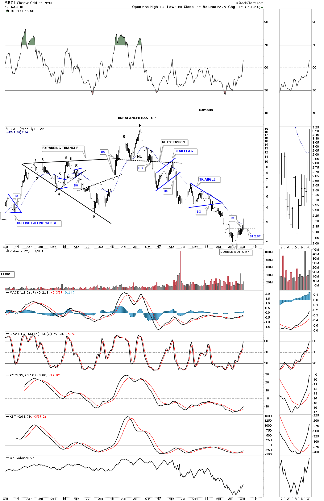
This past week SBGL closed above its 30 week ema and a possible double bottom trendline. A backtest to the double bottom trendline would be around the 2.67 area.
As many of these stocks show most are closer to their lows than their highs. The big question is do we see a final flush to eradicate the last bears? You can also see it’s a pretty mixed bag within the PM stocks which are all over the place as far as their consolidation patterns or reversal patterns are concerned. Some look like they are trying to bottom while many others are still consolidating within their 2011 bear market downtrends. Things can get a little confusing at major turning points as there are a lot of mixed signals. Eventually things will become much more clearer similar to the 2000 bull market when most PM stock would impulse higher and then consolidate together.
Below is the monthly history chart for the HUI which shows all its reversal and consolidation patterns. This would be the bullish setup. All the best…Rambus
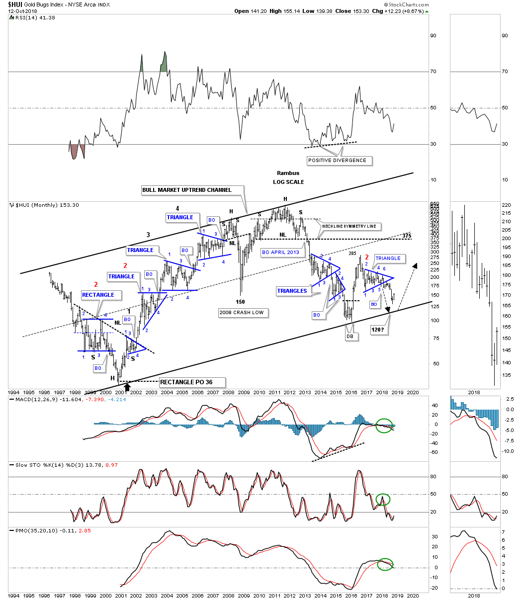
PS: The bearish setup.

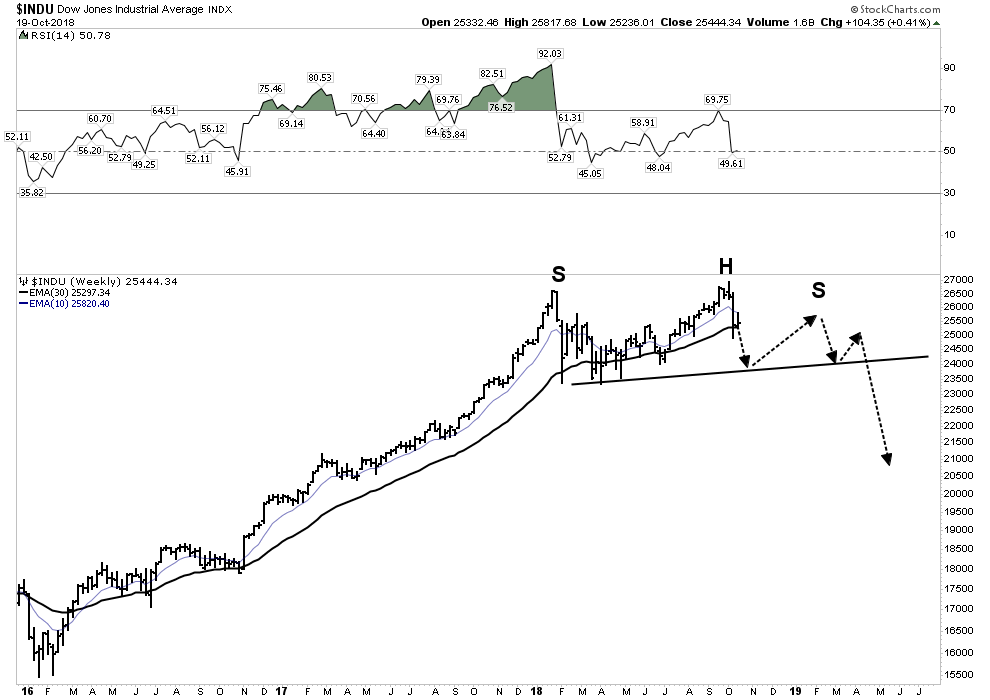
Stock Market Combo Chart Update… – October 25th, 2018
Below is the daily line combo chart we’ve been following which shows the potential H&S tops. Today we are getting a backtest move to the necklines with the NDX putting in a strong backtest. If we start to see the necklines failing to hold resistance that could be a bullish development. So far just the NDX is having a strong backtest.
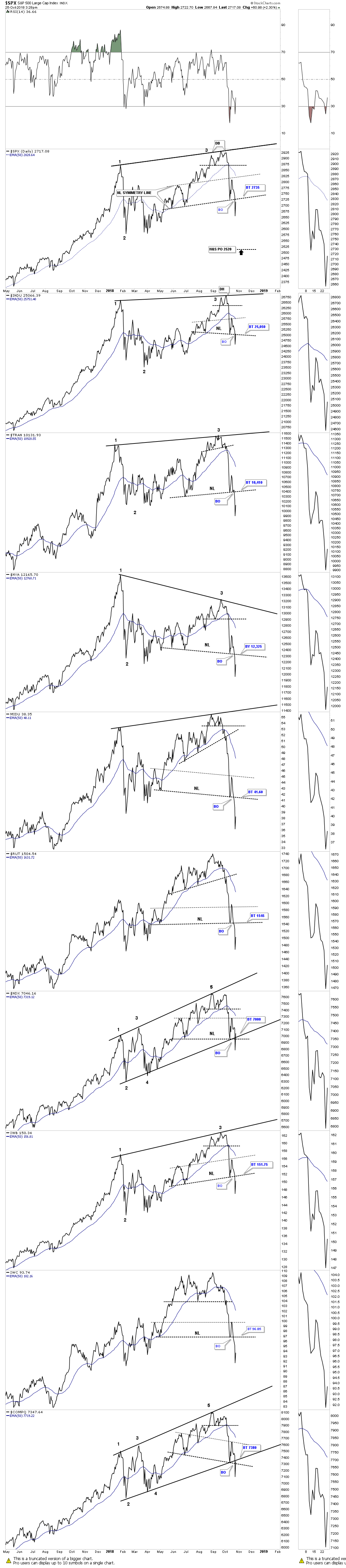
The weekly line combo chart is showing three completed reversal points on most of the indexes. If these US stock market indexes find support in this area and rally up strongly they could be putting in their fourth reversal point which would be need to complete a consolidation pattern. What I’ve done at this point to try and find a possible fourth reversal point is to bring the top rail down to the second reversal point making a parallel trading range for now. I’m just keeping an open mind as I will let the price action dictate to me if we are finishing up a consolidation pattern to the upside or a topping pattern to the downside.
Weekend Report: 2019-The Year of the Bear Market by Plunger – October 21st, 2018
In light of the volatile market action since my last report two weeks ago I am dedicating this report towards the big picture view. I have been presenting the post bubble contraction (PBC) model to you all year long, however I am convinced many still don’t recognize this is actually playing out before their eyes. The noise of daily news events and market commentary has the effect of diverting ones attention away from comprehending the underlying process which is occurring in the world’s financial system. The purpose of this report is to get you refocused on the big picture.
January 2018- Global Synchronized Market Top
A global top is what we witnessed at the beginning of this year and the down side off of the top is now playing out in according to the script of a PBC. Unlike the financial crisis of 2008 which started in the USA and impulsed outward, a PBC begins at the periphery of the world’s economy and is then transmitted towards the core of the senior reserve economy which is the USA. It has always been this way even since ancient times. The Roman historian Cicero stated that a financial disturbance in the outlying regions eventually arrives in Rome affecting the credit structures of the financial center. Those of us in North America seemingly have been immune to this all year…until now. The PBC has now arrived at the doorstep of the world’s financial system and it is now knocking at the door to come in. If one cared to watch you could see it coming all year, but if you just watched CNBC you just got blind sided.
The outer periphery unravels sending capital fleeing to the center
Frontier and emerging markets have been getting destroyed all year long. There has been no place to hide for these investors. Home based equities have been crushed, bond markets have tanked, even cash held in savings has not been a haven since emerging currencies have relentlessly sold off. If you stayed home in any local market sector you got killed…period. So money fled and flowed towards the financial center and that’s why North America has seemed just fine, in fact booming…until now.
World’s Stock Markets minus USA:

Clearly the aggregate of all of the world’s stock markets minus the USA are now entrenched in a confirmed downtrend, I would argue a bear market. It has taken on the form of a year long broad H&S top which has now broken down beneath a rolling over 30 W EMA. This chart says the bears have now got the ball and with capital now flowing away from the outer regions I don’t see the bulls taking back the ball.
Below is a closer up daily view of the MSWorld:

Emerging Markets-A Broad H&S Top ready to accelerate downward
Below we see all the elements of a classic well defined top. A H&S topping pattern with moving averages rolling over and becoming entrenched downward. Higher volume bars are the red down bars. There has been no sign of life here since the blow off January top:
Dow Jones Global Index– All the stock markets of the world
Now we put the USA back into the mix to see what all the stock markets in the world look like. What we see is a massive distribution top which has now broken down under a now declining 30 W EMA. What this chart is saying is it’s now GAME OVER.
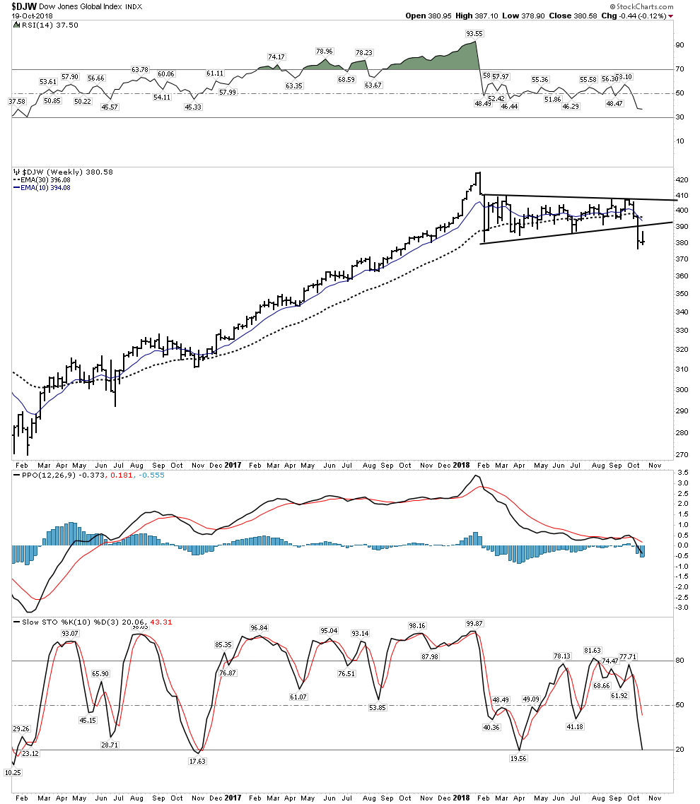
Sure we can expect a back test to the underside of this distribution triangle, which could take the form of a year end rally, but after that and likely when 2019 arrives it’s bombs away. Welcome to the global bear market of 2019.
Tenants of a Post Bubble Contraction
Let’s review the basic tenants of a PBC, refocusing on the big picture.
- There have been 5 complete PBC’s since the late 1600’s
- A PBC comes at the end of a credit cycle which typically spans 50-70 years
- A PBC is the markets way to reset an economy by purging high debt levels from the system through bankruptcy, debt restructuring and debt payoff.
- Once the process completes an economy can resume rapid growth rates since there is no longer an oppressive debt overhang impeding growth.
- The PBC process typically takes 15-20 years and is very painful and typically sloppy.
- Societal institutions undergo radical change due to the trauma of debt restructuring.
Previous Post bubble contractions
The last PBC visibly began in 1929 and ended in the late 1940’s. I say visibly because it actually started to take form in 1926 when the real estate market peaked in Florida and the British economy failed to respond to economic stimulus from the US Federal Reserve. These early symptoms were masked by the stock market blow off which continued into September 1929. Debt began to contract in late 1928, however the stock market had gained a life of its own and was undergoing a massive overthrow top. The world’s economy was bloated with unproductive and unserviceable debt which had been building since the bond funding of WWI which began 15 years earlier. Emerging market debt structures initially began to implode, as we see today, and eventually these forces were transmitted to the core in late 1929 kicking off what is known as the “great depression”.
The PBC of 1873 began with the stock market crash of September 1873 and lasted for the next 20 years. It was caused again by a massive debt build up from railroad construction and from the financial abuses during the US’s War for Southern Independence ending in 1865. Building parallel railroads to nowhere using bond issuance was not sustainable and led to the financial collapse under the Grant Administration.
Commodities Peak 8-9 years prior to ALL PBC’s
In all previous 5 recorded PBC’s commodity prices peaked 8-9 years prior to the final peak in equities. Our current PBC is no different as the world wide commodity peak occurred in mid 2008, nine years before the global synchronous top. This same sequence occurred in all 5 previous PBC’s.
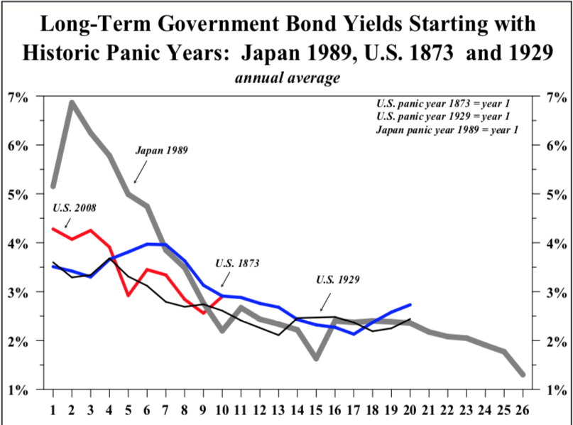
Long Term Government Bonds should continue to trend higher
LT government interest rates are presently in an uptrend, however rates should turn down once the recession takes hold since the economy will no longer be able to sustain elevated rates. Government bonds therefore should progress to new all time highs with rates probing new lows in the coming years. This is hard for many to accept since FED “money printing” would seem to debase the bonds leading to higher rates, but that’s not what the PBC model calls for. In Japan after their 1989 peak JGBs continued to rally for 15 years despite the most radical money printing regime in modern times.
The EPIC Bear Market of 2019
The average investor has no idea of the gravity of today’s situation. He will come to appreciate it in good time however, but it will be too late for him. He is in this situation because he has been conditioned to believe that the FED will ultimately save us. They believe the FED has the tools at their disposal to right the ship. This is tomfoolery pure and simple.
Here is the reality… the era of central banks ability to bubble markets is coming to a close. This ability began with the end of the Bretten Woods monetary regime on August 15, 1971 when they acquired a new “expandable” currency. This bubble power is now in the process of going full circle as its zenith is now behind us. Greenspan’s intervention into the market during the crash of 1987 caused a phased transition in central bank liquidity creation. This liquidity spigot shifted into high gear under Bernanke’s QE policies. This era of rampant accommodation has now run its course and we are on the back side of this 30 year market intervention era.
One can not doubt that Chairman Powell will change course when the market enters a bear market free fall, but the FED will have then lost its credibility and the buyers will not likely return after the initial short covering rally. We will then have to endure a full blown bear market. That is something the USA has not seen since December 1974 at its -70% inflation adjusted bottom from the 1966 highs.
The Good News- Gold in a Bull Market
Just like its always 5 o’clock somewhere, there is always a bull market going on in something. In a PBC it’s time for the gold stocks to shine. This is because as commodities decline in price and the real price of gold rises, the cash flows of gold miners will improve and provide leveraged gains to their stock prices.
When will will this occur? Once the recession takes hold and oil prices begin to decline gold should eventually find a bottom and the gold stocks will enter a bull market. That’s the operating dynamic, but how it actually takes form is unpredictable. As the stock market becomes entrenched in a bear market the FED will ultimately change course and inject liquidity. This event could result in an upward explosion in the gold stocks. Something resembling the blast off in the great August 1982 bull market times ten will likely occur. It will be almost impossible to chase once it launches, it’s rise could be relentless.
The Current Gold Stock Rally- The Real Deal?
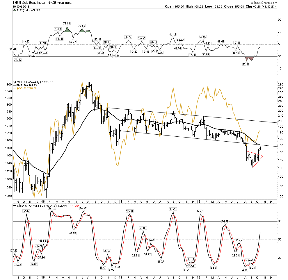
So is this the beginning of the gold bull? No I don’t think just yet. I defer to Rambus’ gold charts, but I see this current rally as a well earned retracement of the prolonged 6 month relentless decline from April to September of this year. In the HUI chart below it appears likely to be in a back test move up to its break down point. The bounce in gold is fairly muted as you can see by the gold line. There is no explosion in volume in the GDX or other individual issues which I expect we will see when the real deal arrives.
Short Squeeze Wild Card
But here is the rub. Gold is sitting on a massive powder keg of TNT. There is so much short interest in gold that if it rises up above 1245 it could take on a life of its own. With over $50B of short interest gold has the potential to rock vertical and in short order, it’s a real possibility. It’s the job of commercial hedgers to sell gold as they have to forward sell in order to collateralize their loans. But here is the thing, they are actually net long! They refuse to sell, this is short term bullish and could lead to a vertical explosion in gold.
I personally don’t want to see this as it would likely flame out once the short squeeze is over and still end up putting in ultimate lower lows before the real bull market begins. Just be aware.
Markets around the world showing their hand
Before discussing strategy let’s update our view of markets around the world, just in case you still don’t believe this really is happening. As mentioned peripheral markets have relentlessly imploded throughout the year and now the decline has advanced to major markets as seen below:
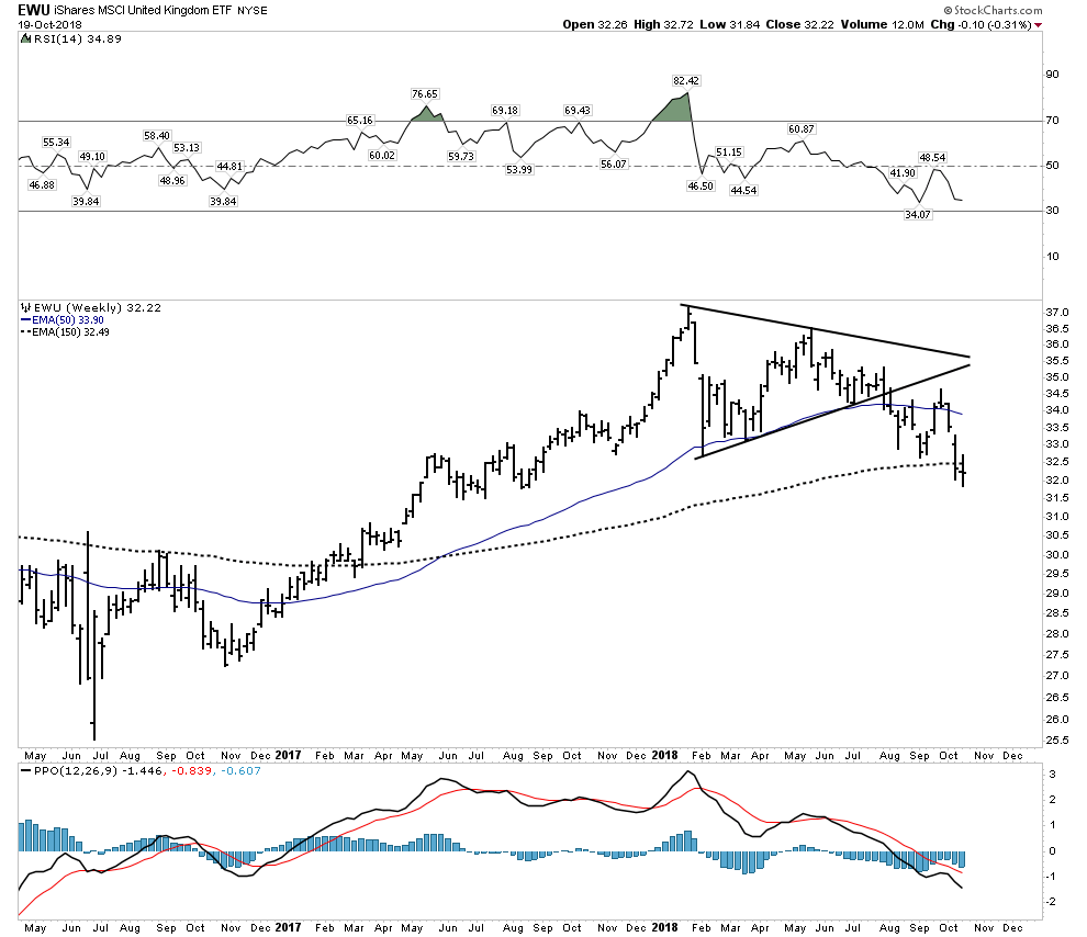
Keep in mind that the UK is a very international senior market and its now below a declining 30 W EMA
Germany– Entrenched decline now below a declining 30 W EMA.

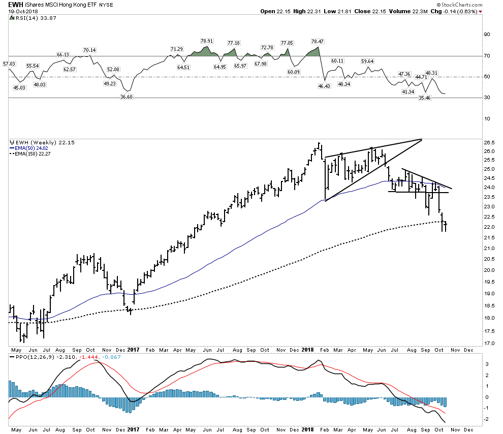
Hong Kong- 7th largest market in the world.
All Pacific-Ex Japan- daily chart

China– The Big Market driving the world’s growth
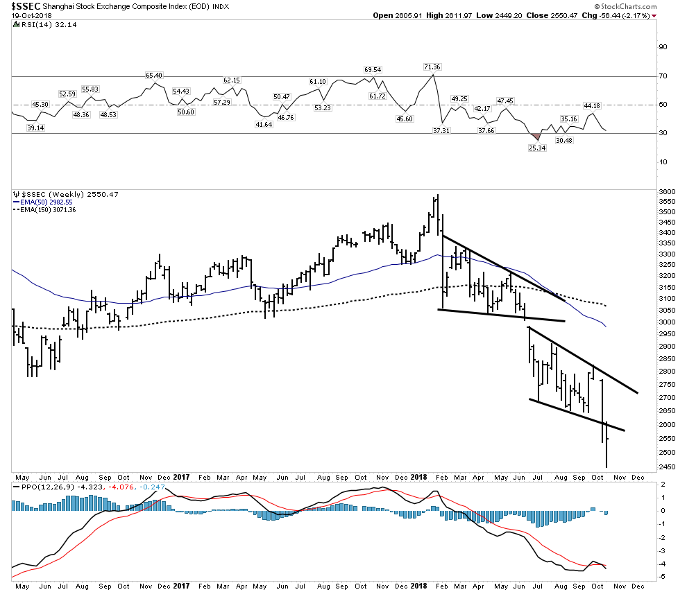
Look again at this chart and think of what it is telling us. It is highly deflationary and distributive. There is simply no sign of life here. The decline this year has been relentless, down 30% this year and 53% off of all time highs. This is signaling a collapse in trade and commodities ahead. Keep in mind that China consumes upwards of 50% of many of the world’s commodities. Plus the government has just lost control of the Yuan, its crashing.
The USA- Just now starting to recognize the story
So all year long the world’s markets have been bleeding out, but the USA has not felt it, but that’s all changed over the past 2 weeks and we are now starting to see what it feels like when liquidity starts to get drained from the system. Look at these two leading interest rate sensitive sectors: autos and builders.
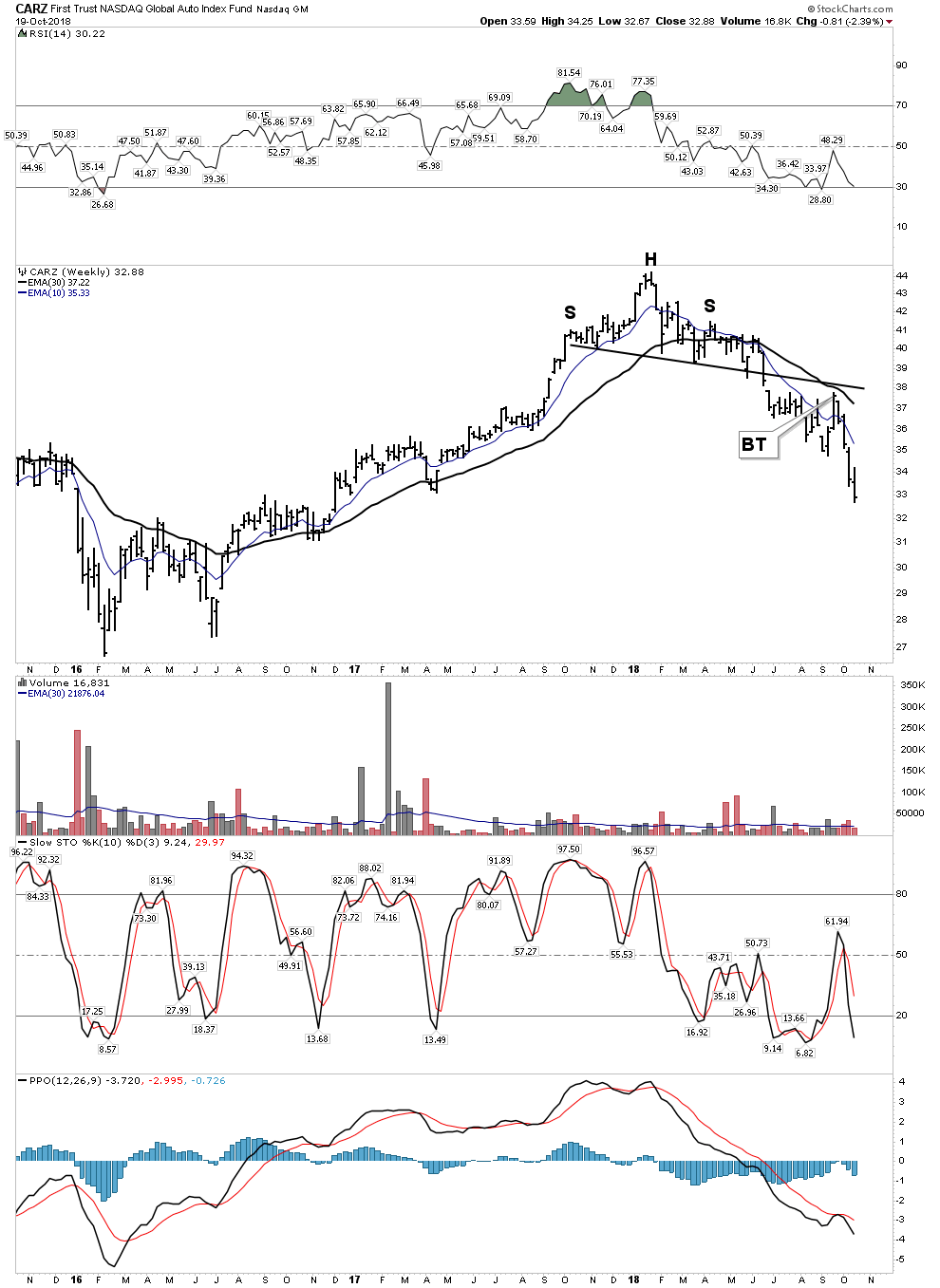
The Home Builders– Brutally Relentless

These are sectors that drive the economy, these two charts are showing the market discounting weakness ahead.
State of the US Markets- At a precipice?
I would say it’s getting close, but not starting the big decline yet, hence the title “The Bear Market of 2019”. Let’s review my hedge fund exit indicator which shows the spread between the 10 and 2 year treasury. You no doubt have heard that the economy goes into recession when the yield curve inverts. Well there are plenty of cases where the economy went into recession without the curve actually inverting, just slightly flattening. So this old saw is an unreliable indicator. What is reliable is when short rates begin to drop after they have been rising in a mature cycle. That’s because it’s saying the jig is up and the economy can no longer support higher short term rates. This is the signal that hedge fund managers who have over stayed themselves in this market are looking for to exit the market. We can see this occurring now in the below chart signaled by the spread rising.
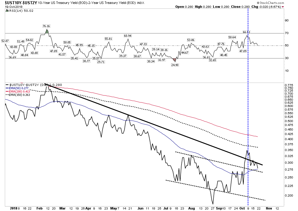
So the actual signal comes when the spread establishes itself in an uptrend after a reversal. As a chartologist looking at the chart above I would say we are almost there. The initial reversal occurred on August 27th and then entered an uptrend. It’s a nice inverted H&S which is now backtesting its breakout above its dashed neck line, but it couldn’t hold above the solid thick down trend line. If it resumed its advance above its Oct 8th peak I would consider it an established uptrend and expect a panic exit of the market.
So here is my analysis: Note the vertical blue dashed line placed on Oct 9th one trading day after the peak in the spread. This is the day that institutional money decided to exit this market en mass resulting in a 1500 Dow point blood bath over the next two days. I would argue the triggering mechanism was our spread breaking out above the solid downtrend line which made it appear as if a new trend was being established. This changed the psychology and as the vertical breakout panicked managed money as they kept one eye on this indicator. We now see however, that this move may have been a false breakout so we may have to wait for confirming upside for the real fireworks to begin. Once it can resume an uptrend above the 150 EMA and certainly the 200 EMA money flow will be in full retreat.
Mr. Markets Most Diabolical Scenario
We all know Mr. Market is a fooler. He makes his moves only after putting most players on the wrong side. This may be what is occurring right now so what would that scenario look like? One more washout to the downside violating the mid-Oct lows would flush out the market and set it up for an nice year end rally. It would spawn hope and draw in investors for the real killing that may lie ahead. After rekindling animal spirits a year end rally could then fail towards the end of the year or even into the first quarter. What would indexes look like then? They would trace out Mr. Markets most diabolical scenario:
Above Projection: 2019-The Year of the Bear, a massive authoritative distributive H&S top.
The Bear Market of 2019- Strategy Session
I hope you see what’s going on here. We are entering a global synchronous bear market. Respect it, as it will hurt you. Actually, if you are a baby boomer approaching retirement… it can destroy you.
Do no harm:
Question: Using all market data over the past 120 years what is the expected cumulative annual return of the stock market for the next 10 years entering the market with new money from today’s valuation levels?
Answer: 1%
That’s right while Wall Street will tell you the market returns 7-8% real annual returns over the long run (10-12% nominal) , that figure does not consider entering at today’s highly valued prices. But here is the kicker… even though a 1% annual return over 10 years may seem paltry, before you get there you will likely have to hold through a 40% draw down!!!! So here is what I tell associates with little market aptitude: Just go to cash and wait until there is blood in the streets then deploy. If you do that you can expect a 15 % annual return and sleep well at night.
That’s our base case-Simple and Safe. Now if you think you want to work for higher returns than that let’s develop a strategy:
Market Strategy
This is a limited overview of the strategy ahead in concept only. Further detail of actual trades will be presented in the future. We still have plenty of time to set up for the big moves ahead.
I plan to conduct only limited bear market operations until end of year since I think it is too late to establish entry points in down trodden sectors, wait first for a failed rally. Commodities and their producers seem to be ripe for a decline in the short term, however my objective for the stock market is to buy the dip for the coming year end rally. The dip buyers have shown up throughout this entire bull market and they will continue to show up until they have been properly bludgeoned. They should provide the fuel for the EOY rally, likely after one more whoosh to the downside. Keep in mind that the retail investor typically buys 1/3 of the way into a bear market. That’s what it takes to wear him down to the point where he says “no mas”. This point comes in the vicinity of the “Point of Recognition” for the bear.
- Play the year end rally, especially in the religious high tech space.
- Short Commodity Producers
- Short Emerging Markets after they have their retracement rally
- Look for a turn in gold stocks and go long after a bottom is formed
- Short Canadian Banks
- Go long LT US Government Bonds
- Stay long Uranium Stocks
- Continue to look for asymmetric investments of opportunity.
I hope you have taken your blinders off and see these markets with eyes wide open. The world wide post bubble contraction is unfolding according to script. It is something no living investor has seen before so few are able to understand it. A PBC is very slow moving as it plays out over 15 years so 99% of investors are unable to recognize it for what it is. That provides us immense opportunity.
Editor’s Note : Who Is Plunger ?
Related Reading:
- Rambus: Blockbuster Chartology – July, 2018
- Rambus: Blockbuster Chartology – April, 2018
- 2017 Annual Wrap Up – Does Your Pension Fund Have A Deep State Drain? – January, 2018
- 1st Quarter Wrap Up 2018 Web Presentation
- Blockbuster Chartology with Rambus – October, 2017
- Blockbuster Chartology with Rambus – July, 2017
- Blockbuster Chartology with Rambus – May, 2017
- Blockbuster Chartology with Rambus – January, 2017
- Blockbuster Chartology with Rambus – October 20, 2016
- Blockbuster Chartology with Rambus – July 21, 2016
- Blockbuster Chartology with Rambus – April 21, 2016
- Rambus: Are We in a Deflationary Spiral? – January 28, 2016
- The Dollar, Gold & the S&P 500 with Rambus – October 15, 2015
WOW. Don’t miss this one. Key sentence: “What this chart is saying is it’s now GAME OVER.”
Am just now beginning to digest what Post Bubble Contraction means.
I don’t think it is game over. I give it 75% chance correction finds a bottom after the election.